
April 2, 2026
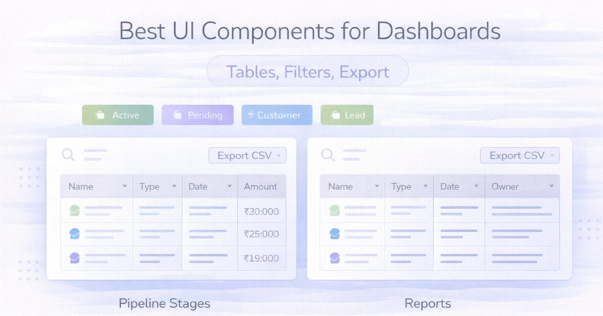
Dashboard UI Components: Tables, Filters and Export
Design operational dashboards with usable tables, predictable filters, secure exports, bulk actions, responsive layouts, permissions and complete data states.
Read articlePublished Updated
Plan admin dashboard development with practical UX, MVP features, roles, tables, filters, permissions, reports, UI states, and a real product example.
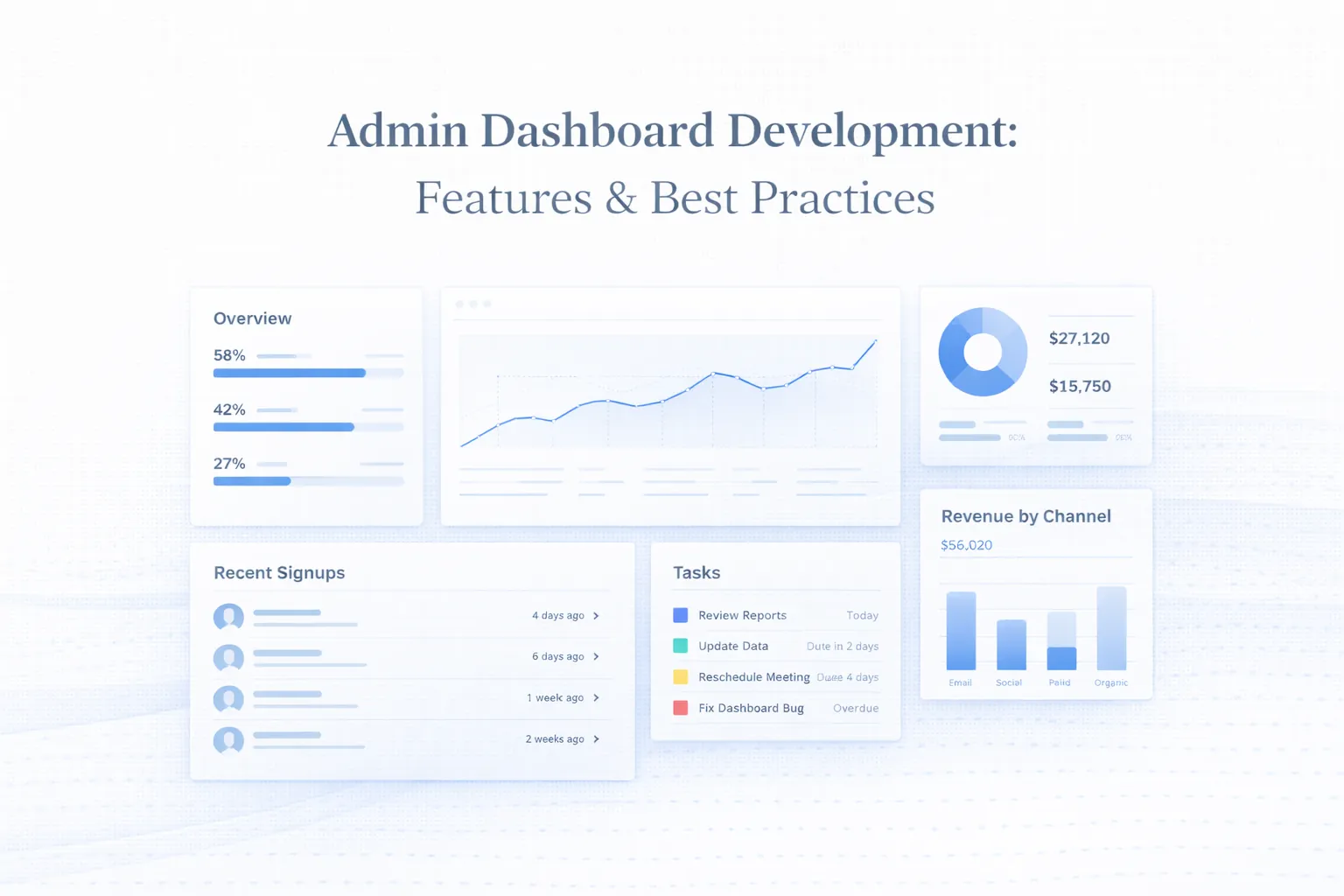
Useful admin dashboard development begins with four questions: what needs attention, who owns it, what changed, and which action is allowed next? Development then connects those decisions to reliable data, permissions, tables, filters, UI states, and audit history. Charts are optional; trustworthy actions are not.
This guide deliberately focuses on how development and UX work together: information architecture, MVP feature priority, tables, filters, states, role-based views, data contracts, and operational usability. It also uses the current VASUYASHII Business Suite owner dashboard as first-party implementation evidence. For indicative pricing, timeline, and procurement scope, use the separate admin dashboard development guide. For role-based report pricing only, use the admin dashboard cost guide.
This guide covers:
Before requesting a dashboard quote, write down one decision a user makes every day. Name the role, the record that triggers attention, the allowed action and the report that confirms the result. Include a failure example: an empty result, rejected approval or unavailable data source. This turns a screenshot-led discussion into a workflow that can be built and tested.
Use the web application development service for a commissioned dashboard or portal. Review the Business Suite product-build case study as first-party implementation evidence, not a customer performance claim. Its existing billing and stock product may fit some needs; a custom dashboard is a separate scope decision.
Complete the software requirements template, then discuss your web application. Include the users, current records, integrations and acceptance checks; private production data is unnecessary for the initial enquiry.
An admin dashboard is not just a screen full of numbers. It is a working interface for managers and staff to monitor status, take actions, and move business workflows forward without confusion.
For an admin dashboard, begin with roles, recurring decisions, record lists, filters, approvals, reports and exception states. A delivery team can then map those operating requirements into a focused interface.
The dashboard scope is ready when every summary answers a named user question and every action has a data source, permission rule, success state, and failure state.
Start with the smallest operational dashboard that lets each role find records, understand status, and complete permitted actions safely. Add advanced analytics only after those workflows are reliable.
| Priority | Build first | Acceptance question |
|---|---|---|
| 1. Access and roles | Login, role-based navigation, protected actions, session handling | Can every test role see only the data and actions it is allowed to use? |
| 2. Operational records | Searchable tables, filters, sorting, pagination, detail views | Can a user find and understand a real record without asking a developer? |
| 3. Workflow actions | Create, edit, assign, approve, reject, change status, add notes | Does every action show success, failure, ownership, and audit history? |
| 4. Decision summaries | A small set of reconciled KPIs, queues, alerts, and exceptions | Can the user move from a number or alert to the records behind it? |
| 5. Reporting and export | Saved filters, date ranges, CSV/PDF export, scheduled reports | Do exports use the same definitions and permissions as the dashboard? |
| Later, when justified | Custom widgets, forecasting, extensive charting, cross-system analytics | Is there a named decision, reliable data source, owner, and measurable use case? |
For commercial estimation, map this priority list to the features, cost, and checklist guide. This keeps the present article focused on development quality and UX while the separate guide handles procurement intent.
These two scopes overlap but are not interchangeable:
| Development question | UX question | Acceptance evidence |
|---|---|---|
| Which API or query produces the number? | Can the user understand the number and its period? | Reconciled sample against the source record |
| Which role can perform the action? | Is the action visible only when useful and allowed? | Permission-matrix test for each role |
| How do filters, sorting, and pagination work? | Can an operator find a record without trial and error? | Timed task using realistic data volume |
| What happens when a request fails? | Does the user know what failed and how to recover? | Loading, empty, partial, error, and retry states |
| What is recorded after an edit? | Can a manager understand who changed what? | Audit-history and rollback scenario |
A dashboard can look polished while failing these development checks, or be technically correct while remaining hard to operate. The release needs both sets of evidence.
Dashboard development matters because it sits at the intersection of data, workflow, and UI. If even one of those is weak, the product feels harder to use than the process it was supposed to replace.
Owners, managers, analysts, support staff, and operations teams often need different metrics and actions. One shared layout rarely serves all of them equally well. This changes the outcome because role clarity determines what information appears first and what actions stay protected.
A dashboard can only be trusted if the underlying data is structured well, updated correctly, and clearly defined across modules. This changes the outcome because weak data design creates misleading KPIs and undermines user confidence quickly.
The screen should not stop at showing numbers. It should let users search, filter, update status, assign work, or investigate exceptions without friction. This changes the outcome because actionable UI is what makes a dashboard operational instead of decorative.
Cards, charts, tables, and side navigation should support fast scanning and clear movement between overview and detail views. This changes the outcome because strong hierarchy reduces cognitive load and training time.
Sensitive data, financial actions, and administrative controls need to reflect role-based access and leave a reliable action history. This changes the outcome because dashboard trust depends as much on control as on usability.
Dashboards that feel smooth with sample data can break down when tables, filters, exports, and charts have to handle live operational volume. This changes the outcome because performance planning affects both user experience and future reporting scalability.
A strong dashboard implementation connects the overview to underlying records, keeps definitions consistent across reports, and gives staff a recoverable path when data or an action fails.
Summary sections should show the few metrics users need to assess status quickly, not every number the database can produce.
Focused KPIs help teams see priority changes without digging through unnecessary noise.
Most admin work happens in lists and records, so filters, sorting, bulk actions, and fast status changes are central dashboard capabilities.
This is often the part of the product that saves the most time day to day.
Each role should see the right menu items, the right data depth, and the right controls without exposing sensitive functions broadly.
Tighter permissions make the interface safer and less cluttered.
Managers need reports, while operators need timely alerts and tasks. Both should be easy to access without sending users into separate systems.
Well-planned reporting turns the dashboard into a decision tool instead of a passive monitor.
Buttons, badges, forms, loading states, and empty states should behave consistently so users learn the interface once instead of relearning every module.
Consistency improves speed, trust, and development maintainability.
Admin systems should make it easy to inspect changes, review user activity, and understand why a workflow succeeded or failed.
Support becomes faster and accountability becomes much clearer.
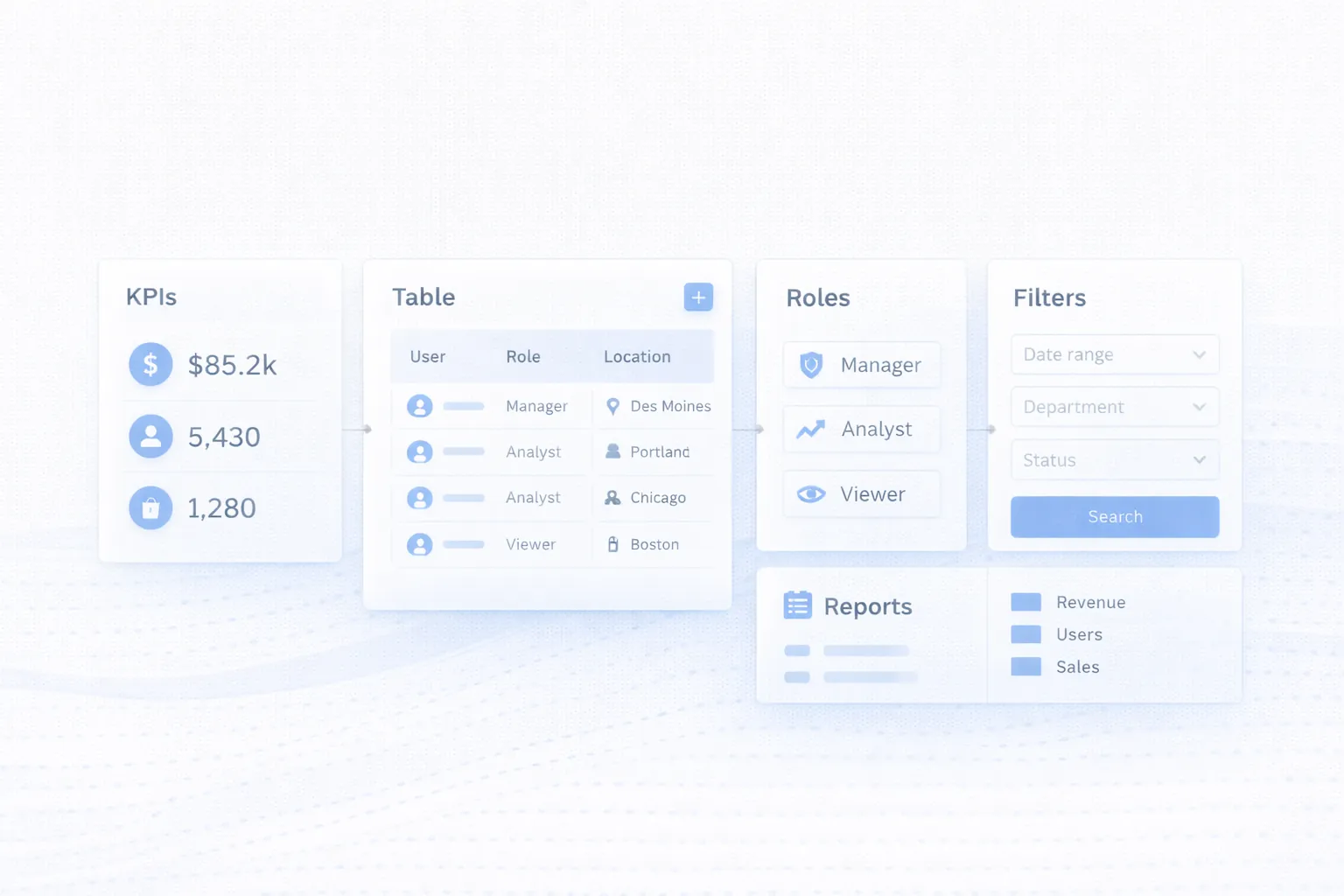
Teams can monitor new leads, pipeline stages, pending follow-ups, source performance, and conversion activity in one place.
The main gain is faster action and clearer manager visibility.
Dashboards for service, logistics, or production teams often combine statuses, pending tasks, delays, and branch-level summaries.
That reduces manual coordination and makes exceptions easier to spot quickly.
Approvals, payouts, invoices, reconciliations, and account health can all be monitored through a permission-aware interface.
This creates a stronger audit trail while reducing repetitive checking.
Ticket queues, SLA status, ownership, and escalations can all live in a dashboard built for fast team response.
The interface helps keep service quality visible instead of reactive.
The VASUYASHII Business Suite provides a concrete example of an operational dashboard rather than a decorative analytics screen. Its owner view brings inventory value, available units, customer dues, expenses, low-stock signals, and company context into one workspace. The surrounding modules let the user move from the summary into products, invoices, purchases, payments, and reports.
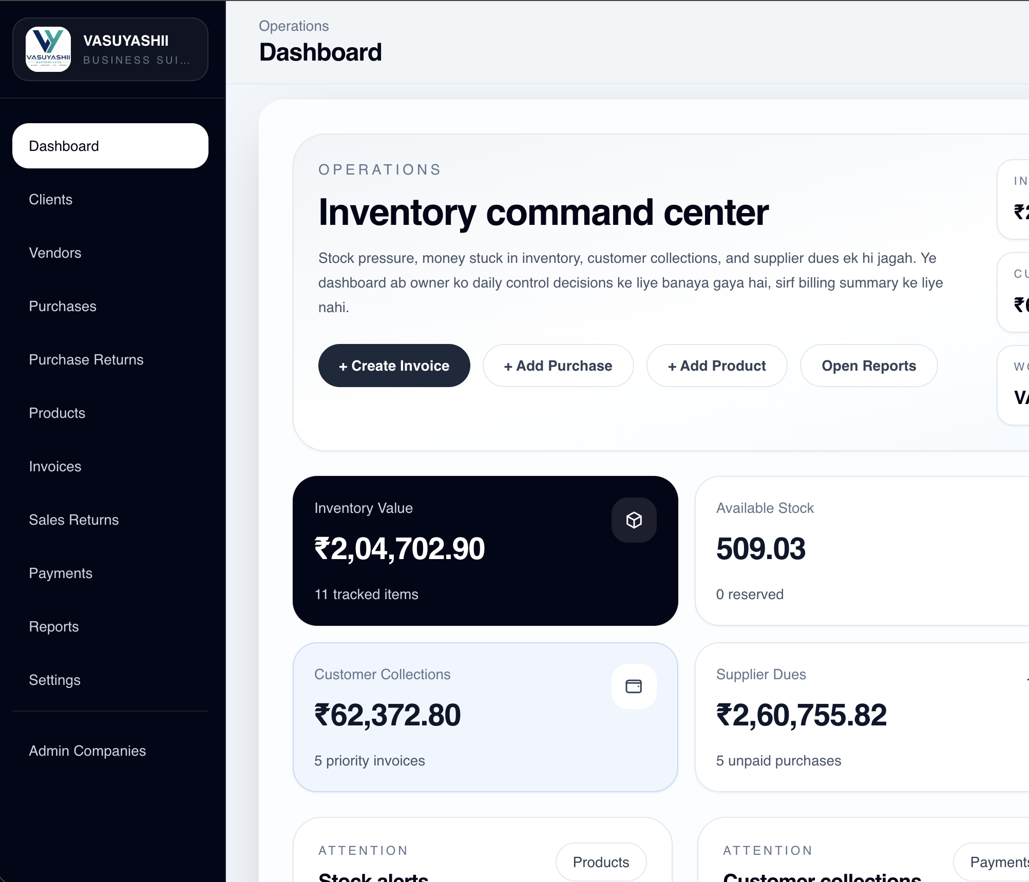
This screen demonstrates four useful dashboard decisions:
The product page shows the current scope and six real screens without claiming unsupported customer outcomes. Use the same evidence standard for a new dashboard: document the workflow, show actual states, and test whether users can move from a signal to the permitted next action. The permission matrix template helps define that final point before development.
Before approving dashboard development, review the interface against seven practical questions:
For a new build, start with the admin dashboard features, cost and checklist guide, then use this UX review to test each screen. The permission matrix template and web-app RBAC guide help define protected actions.
An admin dashboard is valuable when owners and managers need fast visibility into operations. For example, a service business may need pending jobs, assigned staff, overdue follow-ups, and revenue summaries. A warehouse may need stock alerts, purchase requests, dispatch status, and branch reports.
A useful dashboard should answer: what needs attention today, who owns it, and what decision should be taken next.
Connect dashboard planning with the Web App Development Hub, web application services, and software development services before building visuals.
For a dashboard UX review, bring one daily workflow, the roles involved, current screens or spreadsheets, required filters and the decisions users cannot make quickly today.
When the dashboard's primary job is management reporting, use the custom business reports dashboard guide to specify source data, metric definitions, refresh rules, and reconciliation.
Crowded dashboards may look impressive in demos but quickly overwhelm real users. Prioritization is more valuable than density.
Many teams over-design summary cards and under-design the screens where actual work gets done. The dashboard ends up looking polished but still feeling slow in daily use.
If all users see the same data and actions, the product becomes risky and harder to navigate. Role design improves both safety and usability.
Operational interfaces need clear states for delays, missing data, and failed actions so users know what is happening. State design is part of UX quality, not optional polish.
Dashboards built only from stakeholder opinions may miss the habits and shortcuts actual operators depend on. Short feedback loops with end users help reveal those gaps before launch.
Dashboard UX becomes more complex as roles, data sources, tables, report types and action states increase. A simple KPI overview is far easier to operate than a full workflow dashboard with search-heavy records and permission-aware actions.
If the dashboard is part of a broader system, backend data structure and metric definitions still shape the interface. Use the admin dashboard development checklist for scope and cost planning rather than duplicating that intent here.
The most important scaling question is whether the dashboard is only for visibility or also for action. Once actions, approvals, exports, and alerts are involved, planning depth needs to increase.
Before building a KPI card or chart, write its decision contract: definition, data source, refresh rule, allowed roles, drill-down destination, and expected action. For example, “overdue receivables” must define whether cancelled invoices, credit notes, and partial payments are included. Without that definition, finance and sales can read the same number differently.
This contract also prevents decorative dashboard growth. If a metric has no owner or action, it may belong in a report rather than the first screen. For complex permissions, pair the dashboard specification with a permission matrix and test the result against the RBAC security checklist.
Dashboard requirements become clearer when tied to an operating workflow. Review secure data-entry panel design, multi-branch reporting rules, and repair job-card operations for examples of actionable queues and reconciled metrics.
Usually the combination of the right KPIs, actionable tables, and clear role-based views. Without those, the dashboard may look modern but still fail operationally.
Usually no. Different users need different metrics, actions, and levels of detail. Tailoring views by role improves clarity and safety.
No. Many teams gain more value from strong tables, filters, and alerts than from extra charts. Use charts where they clarify trends or comparisons.
Because real operational work often happens in records, lists, assignments, and status changes. If table UX is weak, the whole product feels slow.
They need a clear design system, thoughtful navigation, modular reporting, and regular pruning so the interface does not become crowded over time.
Multiple roles, rich filters, reports, exports, live data, and integrated actions create more states, permissions and failure paths to design and test.
Yes, but mobile needs should be defined clearly. Some dashboards require responsive monitoring views while others need full mobile task execution flows.
The next move is to define the first operational decision, the records that support it, the roles allowed to act and the states the interface must handle. For commercial scope, use the dedicated development guide; for an interface review, share the current workflow and screens.
Related Articles
April 2, 2026
Design operational dashboards with usable tables, predictable filters, secure exports, bulk actions, responsive layouts, permissions and complete data states.
Read article
March 27, 2026
Restaurant admin dashboard features guide with owner-panel reports, pricing in India, tech stack, timeline, and cost drivers for restaurant software today.
Read article
May 23, 2026
document management system portal: practical 2026 guide with features, INR pricing, roadmap, tech stack, mistakes, FAQs, and Indian SME tips today safely.
Read article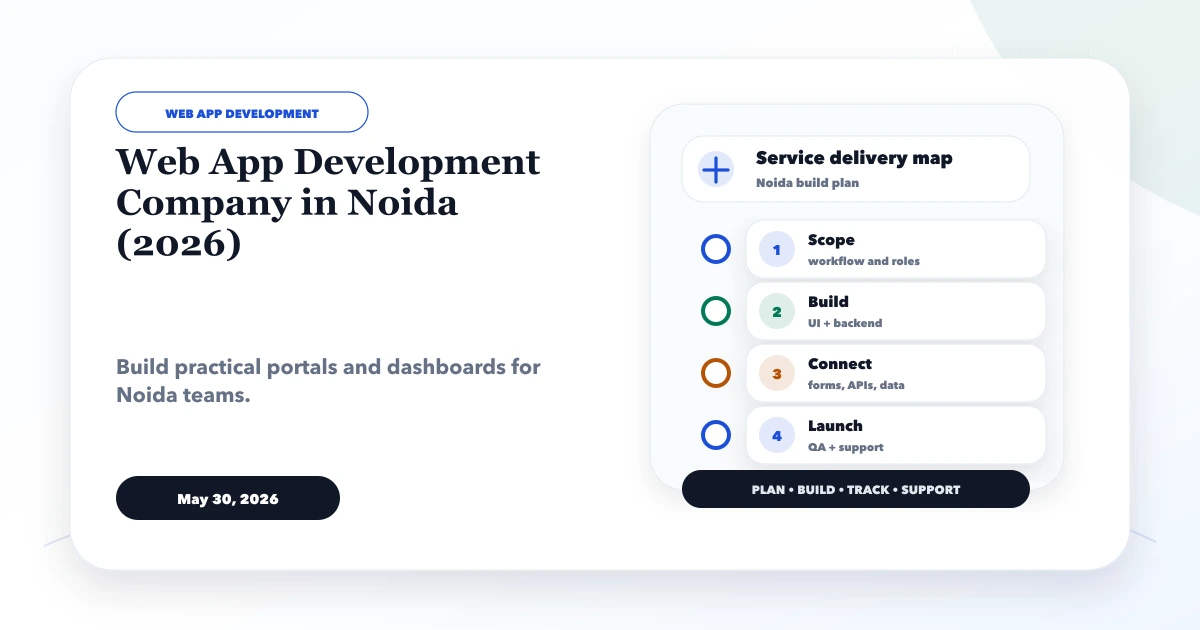
May 30, 2026
Plan a Noida business web app with role-based workflows, dashboards, approvals, integrations, audit controls, phased delivery, and ownership.
Read article