
June 6, 2026
Mohan Nagar Business Website Design Checklist
Plan a Mohan Nagar business website for calls, visits, directions, service availability, trust, WhatsApp enquiries, and accurate local information.
Read articlePublished Updated
Plan an effective above-the-fold section with a clear offer, proof, primary CTA, mobile hierarchy, page-speed safeguards, and practical conversion tracking.
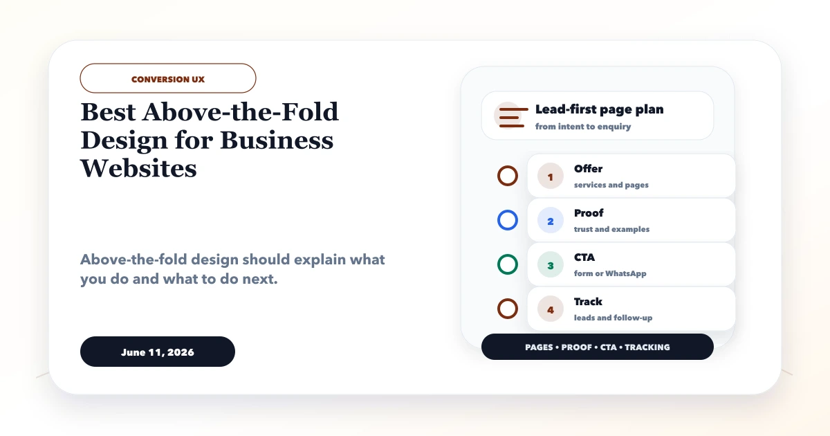
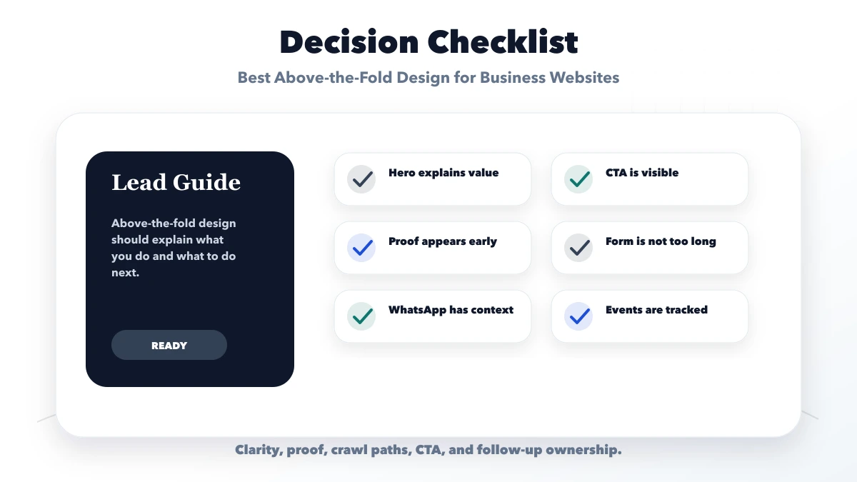
This guide explains the best above-the-fold design for business websites that need a stronger first screen for trust, clarity, and enquiries. It focuses on offer clarity, verifiable proof, one primary CTA, mobile hierarchy, page speed, and practical conversion tracking.
The goal is a first screen that answers category, audience, value, proof, and next action before visual decoration competes for attention.
By Tushar C. (Founder, VASUYASHII). Reviewed by VASUYASHII Editorial for practical website planning, SEO structure, lead generation, WhatsApp flow, enquiry forms, and business website delivery.
The best above-the-fold design includes a clear headline, short value statement, proof, primary CTA, contact option, relevant visual, and fast mobile layout.
Many websites lose visitors because the first screen is a generic banner, oversized image, or vague tagline with no obvious action.
For a service business, the hero should pre-qualify the visitor: name the service, signal the intended buyer, show one credible reason to continue, and route the visitor into one primary contact action.
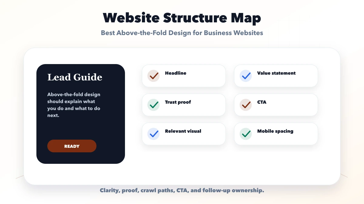
Check each hero element against one job. The headline establishes relevance, the supporting sentence qualifies the offer, proof reduces risk, and the CTA defines the next interaction.
| Hero layer | Required content | Acceptance question |
|---|---|---|
| Relevance | Literal offer, intended buyer, useful outcome | Can a new visitor identify the service in five seconds? |
| Confidence | One verifiable screenshot, project, review, or process signal | Does the proof directly support the headline? |
| Action | One primary CTA with a clear post-click expectation | Does the visitor know what happens after clicking? |
| Continuation | A visible edge of the next proof or service section | Is it obvious that useful evaluation content continues below? |
The rest of the page should continue the promise made in the hero. A pricing-led hero needs pricing context below; a demo-led hero needs real product evidence; a local-service hero needs genuine service-area proof.
Launch one measurable hero version, record its copy and CTA placement, and compare qualified actions rather than raw clicks before introducing a second variant.
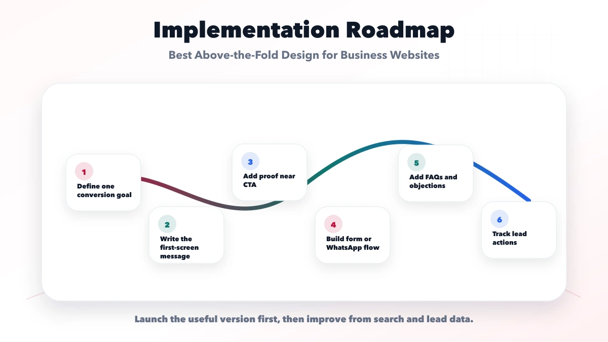
On desktop, the first screen can support a headline, short explanation, one primary CTA, one secondary action, and a visible proof element. On mobile, the same content must become stricter because the viewport is smaller. Keep the offer and primary action visible before adding long benefit lists, decorative media, or multiple badges.
A practical order is:
For a Delhi NCR service business, a better hero says what is being built, identifies the target business, and offers a clear next step. "Modern digital excellence" is weaker than "Lead-focused business websites for Delhi NCR service companies" because the second version helps the right visitor self-qualify.
Track CTA clicks, form starts, completed enquiries, scroll depth, and mobile-versus-desktop conversion rate. A high hero click rate with low lead quality may mean the promise is too broad. Low clicks with strong time on page may mean the CTA appears too early or lacks context. Use actual enquiries to decide whether copy, proof, pricing guidance, or CTA placement should change.
The WhatsApp CTA placement guide, contact page conversion guide, and service-page content guide help connect the first screen to the rest of the funnel. For implementation, review website development services and services.
The VASUYASHII homepage provides a real first-screen example that can be reviewed without inventing conversion claims. It identifies the business as a software and automation provider, presents clear service context, and gives visitors direct paths into services, demos, projects, and contact. The useful lesson is the structure, not a claim that one visual treatment guarantees more leads.
When reviewing any homepage hero, perform this five-second test:
If the answers are vague, revise the message before redesigning the background. A high-production hero cannot compensate for an unclear offer.
Use the strongest proof the business can verify:
| Proof type | Good use above the fold | Avoid |
|---|---|---|
| Product screenshot | Show the actual interface or output | Decorative mockup that hides the product |
| Case study | Name the workflow and link to details | Unsupported revenue or growth claims |
| Review | Use genuine attributable feedback | Written-by-owner testimonial text |
| Process | Explain the next delivery step | Generic “best quality” badge |
| Demo | Let the visitor inspect a working flow | Calling a static image a live demo |
The Business Suite product page is a useful product-led example because it shows real software screens and states the current scope and exclusions. The services collection demonstrates the equivalent approach for service work.
On mobile, verify that the headline wraps without hiding the CTA, the button remains reachable, sticky controls do not cover text, and the page begins scrolling normally. Test at least one smaller Android-size viewport and one modern iPhone-size viewport. Also confirm that the hero image has stable dimensions so loading does not move the CTA after the user tries to tap it.
Write the hero in plain text before opening the design tool:
Read the six answers as one sequence. If the category and outcome repeat each other, shorten the copy. If proof is unavailable, use a transparent process or working demo instead of a fabricated statistic. If the CTA requires a long explanation, the offer is probably still too broad. This worksheet keeps copy, design, and measurement aligned before development begins.
The checklist is passed only when a new visitor can explain the offer and next step without relying on navigation labels or scrolling through the complete page.
VASUYASHII starts the first-screen scope with the literal offer, buyer segment, available proof, primary CTA, mobile constraints, and measurement event. Design exploration follows those decisions.
Useful links: web application services, software development, integrations, services, and contact.
Do not approve the hero from a wide desktop mockup alone. Verify copy hierarchy, proof visibility, CTA reachability, image stability, and follow-up behavior on the actual mobile build.
The hero can be visually balanced in a design file but still render late or shift on mobile when several font files load. Review the website font speed, trust, and conversion guide before approving display typography, fallback behaviour, and headline wrapping.
It should include a clear offer, proof, CTA, lead form or WhatsApp option, FAQs, and tracking.
Most service businesses should use both. Forms collect structured details, while WhatsApp reduces friction.
Track form submits, WhatsApp clicks, call clicks, quote requests, and source pages.
Yes. Review lead quality, click behavior, GSC data, and customer questions, then improve sections.
Yes. VASUYASHII can design and build conversion-focused pages with tracking and lead flow.
The first viewport needs to connect with the rest of the buying journey. Use the qualified-lead homepage structure to sequence service routes, current proof, product evidence, FAQs, and measurement after the hero.
If you want a practical plan for best above the fold design for business websites, VASUYASHII can help with scope, design, development, SEO setup, lead flow, launch, and maintenance.
Related Articles
June 6, 2026
Plan a Mohan Nagar business website for calls, visits, directions, service availability, trust, WhatsApp enquiries, and accurate local information.
Read article
May 7, 2026
Best Website Design Company in Delhi NCR (2026) guide with pricing, process, timeline, deliverables, proof links, and practical planning for businesses in.
Read article
June 11, 2026
Use practical homepage hero formulas for service businesses with clear audience, offer, proof, CTA hierarchy, mobile layout, and conversion tracking.
Read article
March 23, 2026
Compare website design and development deliverables, costs, timelines, handoffs, hiring models, acceptance checks, and the right team for your business website.
Read article