
April 27, 2026
Best “Contact” Page Design for Leads
Best contact page design for leads with forms, trust blocks, WhatsApp, map choices, pricing, and CRO tips for Indian business websites.
Read articlePublished Updated
Design a contact page that routes qualified enquiries with clear actions, short forms, privacy cues, reliable delivery, mobile usability and useful analytics.
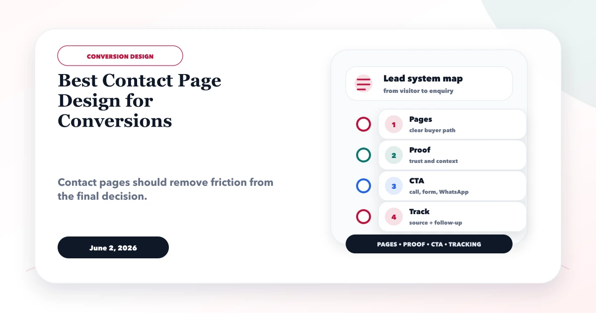
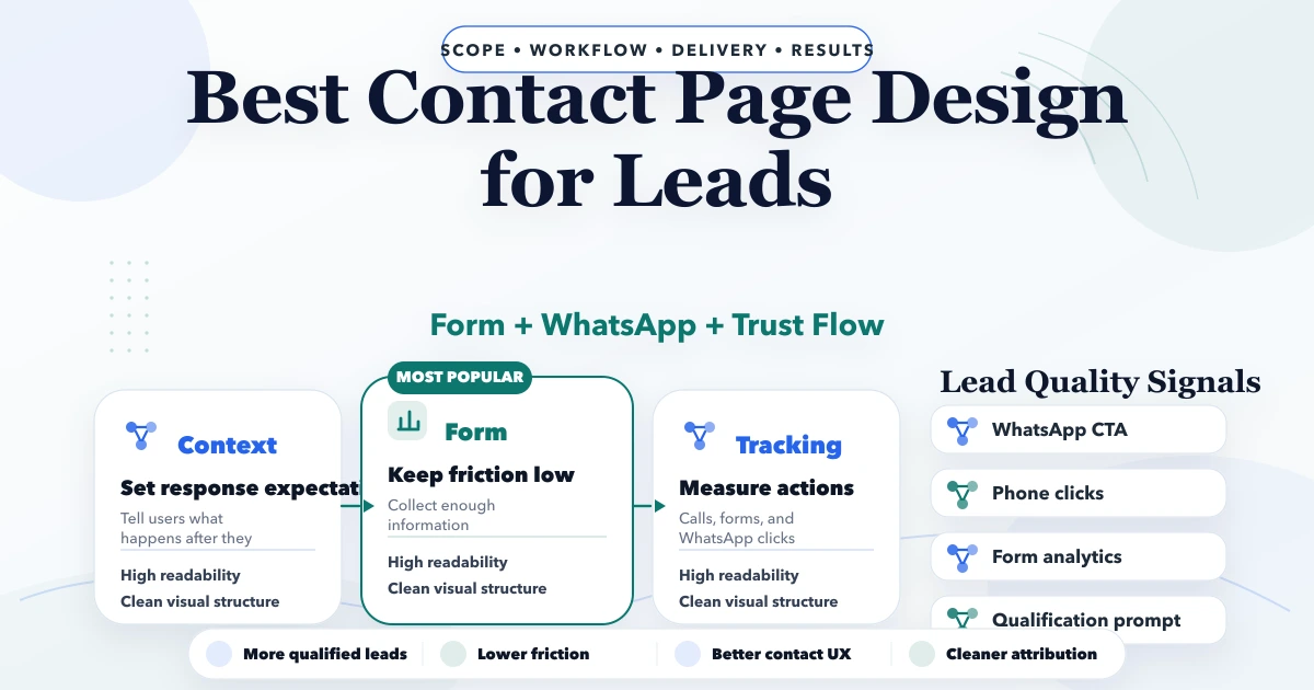
A contact page should help a visitor choose the right communication route, provide enough context for a useful reply and understand what will happen after submission.
That is different from simply placing a long form beside an address. A service buyer may want to call about an urgent issue, ask an initial question on WhatsApp, send a detailed project brief or confirm whether the company serves a location. The page should support these jobs without making every visitor complete the same process.
Conversion quality matters as much as form volume. Ten enquiries with a clear service need, location and contact preference can be more useful than fifty vague messages generated by a misleading CTA.
A strong contact page normally includes:
The right layout depends on the lead-handling process. Do not add a channel that nobody monitors.
Contact pages serve several different intents:
| Visitor situation | Best first route | Page information needed |
|---|---|---|
| Urgent operational issue | Phone | Availability and working hours |
| Early service question | WhatsApp or short form | Expected reply time and service options |
| Detailed project requirement | Structured form | Scope fields, attachment alternative and next step |
| Location-dependent visit | Call or directions | Verified address, map and visit policy |
| Existing customer support | Support route | Account or reference instructions |
Mixing sales, careers, vendor messages and customer support into one unlabelled inbox creates slow responses. Use simple routing labels or separate destinations when the team can actually maintain them.
The primary action should match the business’s fastest reliable response process.
Secondary actions should remain visible but quieter. Repeating four equally prominent buttons forces visitors to make an unnecessary interface decision.
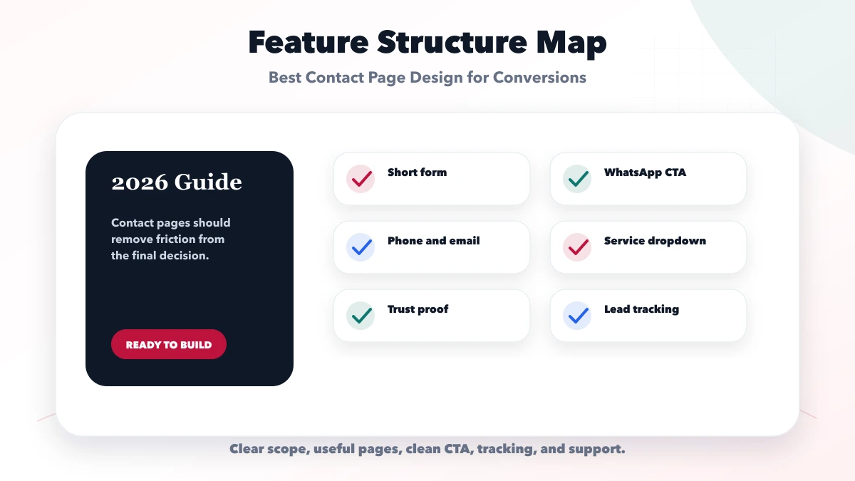
Every field creates effort and a data-handling responsibility. For many service enquiries, the first-step form needs:
Optional qualifiers can be useful when they change routing or the first reply:
Do not require details simply because the CRM has a field for them. If a long technical brief is necessary, explain why and let the visitor prepare it rather than presenting a wall of inputs without context.
Use persistent labels, not placeholder-only instructions. Placeholders disappear during typing and can be difficult to recall.
Mark required and optional inputs explicitly. Avoid making every field mandatory.
Show the error beside the relevant field and explain the correction. “Invalid input” is less useful than “Enter a 10-digit Indian mobile number” when that is the actual accepted format.
Use appropriate name, email, tel and autocomplete attributes. On mobile, the correct keyboard reduces effort.
Confirm that the request was received, state the expected response window and preserve a fallback contact route. Do not clear the form and leave the visitor wondering whether anything happened.
The contact-form spam reduction guide covers honeypots, rate limits and server-side validation without creating unnecessary user friction.
WhatsApp can reduce the distance between interest and conversation for Indian service businesses. A prefilled message can help the user provide context, but the page still needs:
A floating button should not cover form controls or mobile navigation. See the WhatsApp CTA placement guide for page-level placement decisions.
Make phone numbers tappable and show working hours if calls are not always answered. Display an email address only when its inbox is monitored.
An embedded map is useful for a clinic, office, showroom or venue that accepts visits. It may add unnecessary network cost for a remote service company. In that case, state the service region and provide a verified postal identity where appropriate.
Name, address and phone details should remain consistent across the website and genuine business profiles. Do not invent branches or virtual locations for local visibility.
The contact page is usually late in the buyer journey, but visitors may still need reassurance. Relevant trust signals include:
Avoid generic counters, fake urgency and unsupported statements such as “100% guaranteed results.” Proof should help a visitor evaluate the next step, not pressure them.
State why the requested data is needed and how it will be used. If promotional messages require separate consent, do not hide that permission inside a general submit button.
Useful implementation rules include:
Legal requirements depend on the business, data and jurisdiction. Obtain appropriate professional advice where needed.
Analytics should answer operational questions:
Useful event names may include contact_click, whatsapp_click and generate_lead. Event parameters can describe page path, CTA placement or service category, but must not contain names, phone numbers, email addresses or message content.
The current VASUYASHII website implements these privacy-conscious interaction names globally. This confirms the tracking contract exists; it does not prove that a click became a sale or that the page achieved a particular conversion rate. Use the lead tracking setup guide to connect event design with reporting.
A polished form that loses submissions is worse than a plain form that works.
The implementation should define:
If several team members manage leads, an integration and automation service can route records and notifications. Automation should support ownership, not replace it with an unmonitored workflow.
A practical sequence is:
The sequence can change when the business is visit-led or support-led. What matters is that the visitor does not need to search the footer for the only working contact route.
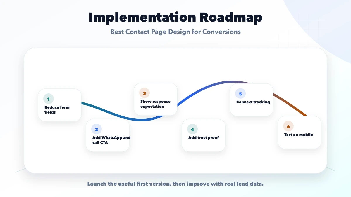
Identify who receives each route, expected reply time and what information is needed for the first response.
Choose the primary CTA, form fields, supporting details and trust evidence.
Validate on the server, add abuse controls and create an observable delivery path.
Use the form design and spam-control guide for layered validation, rate-limit, duplicate, challenge-token, and confirmed-success acceptance checks.
Track clicks and confirmed success states without form values.
Use mobile and desktop widths, keyboard navigation, slow network conditions, invalid inputs and destination-inbox checks.
After sufficient real traffic, compare qualified enquiries by page and action. Do not redesign around a tiny sample or raw click counts.
VASUYASHII treats contact-page work as a combination of UX, delivery reliability, privacy-safe tracking and follow-up ownership. We can design the page and connect supported lead routes, but we do not promise a conversion percentage without traffic, offer and measurement evidence.
For a complete site journey, review website development services and web application services. A focused requirement can be shared through the VASUYASHII contact page.
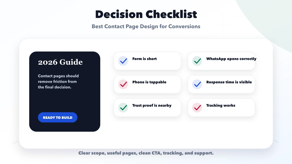
Use the fewest fields needed to route and answer the first enquiry. Four fields are often enough for a service business, but complex projects may need additional qualifiers.
Only when the target customers use it and the business monitors it reliably. Otherwise, use a form or phone route that matches the operating process.
It can include starting bands or explain pricing factors when that helps qualification. Do not publish a misleading fixed price for highly variable work.
No. Add one when visitors need to reach a physical location. A service-area statement is often more useful for remote or appointment-only businesses.
Prefer a server-confirmed successful submission event. A button click alone does not prove delivery.
Test after deployment or integration changes and on a recurring schedule. Verify both the user-facing success state and the receiving system.
Document the monitored channels, required qualification details, response owner and privacy boundary. Then use the checklist above to redesign the page around a reliable conversation rather than a decorative form.
Related Articles
April 27, 2026
Best contact page design for leads with forms, trust blocks, WhatsApp, map choices, pricing, and CRO tips for Indian business websites.
Read article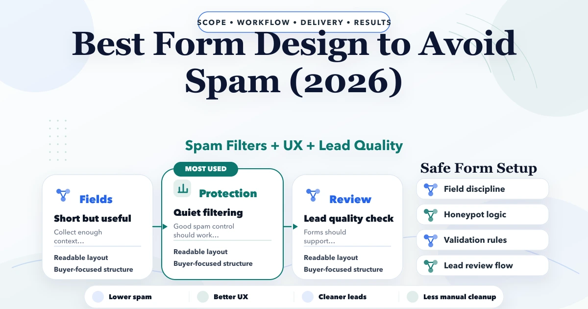
May 3, 2026
Best form design to avoid spam in 2026: field choices, honeypots, validation, UX, and lead-quality setup for business websites.
Read article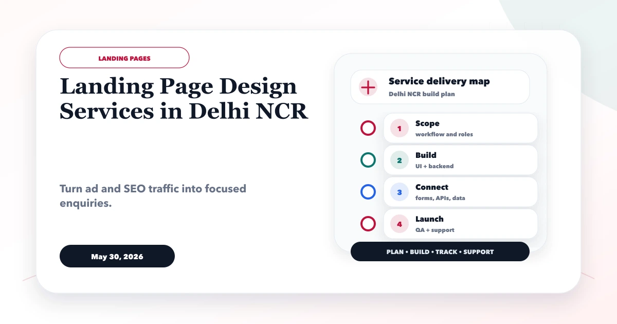
May 30, 2026
Landing page design services in Delhi NCR guide with conversion structure, WhatsApp CTA, forms, speed, pricing, testing, and launch checklist.
Read article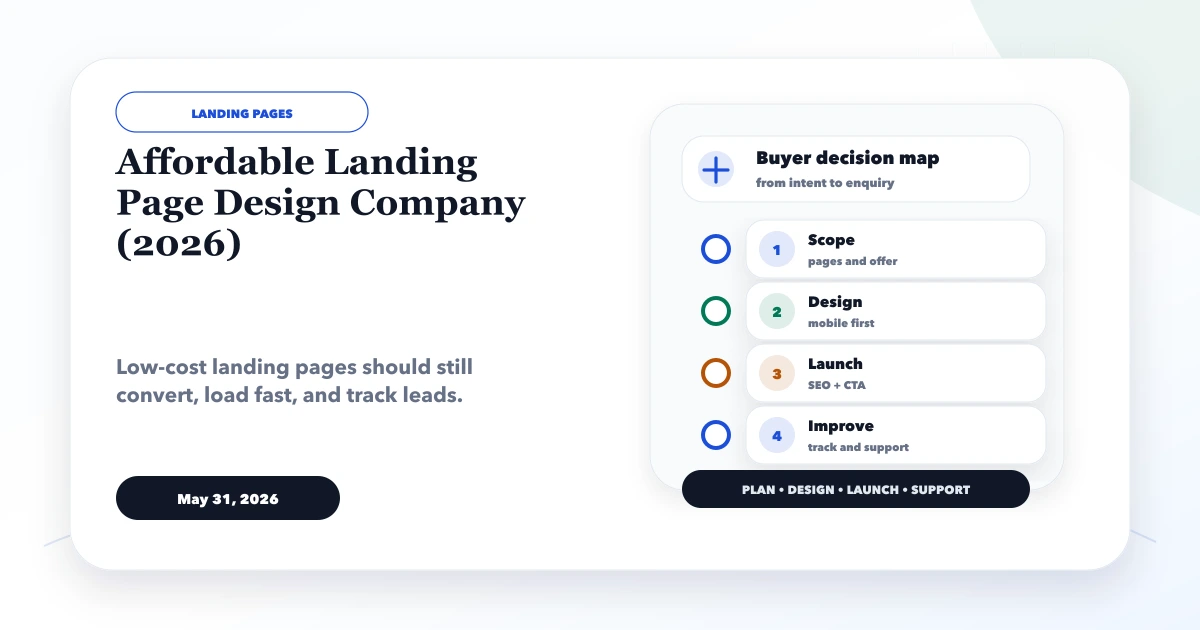
May 31, 2026
Compare affordable landing-page providers by offer clarity, copy, responsive design, forms, speed, analytics, ownership, testing, and complete delivery scope.
Read article