
April 26, 2026
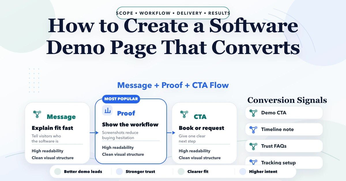
How to Create a Software Demo Page That Converts
Software demo page that converts: page structure, pricing, proof blocks, CTA flow, tech stack, and launch checklist for better leads.
Read articlePublished Updated
Plan a service-business homepage that clarifies the offer, earns trust, routes visitors, proves capability, answers objections, and tracks qualified leads.
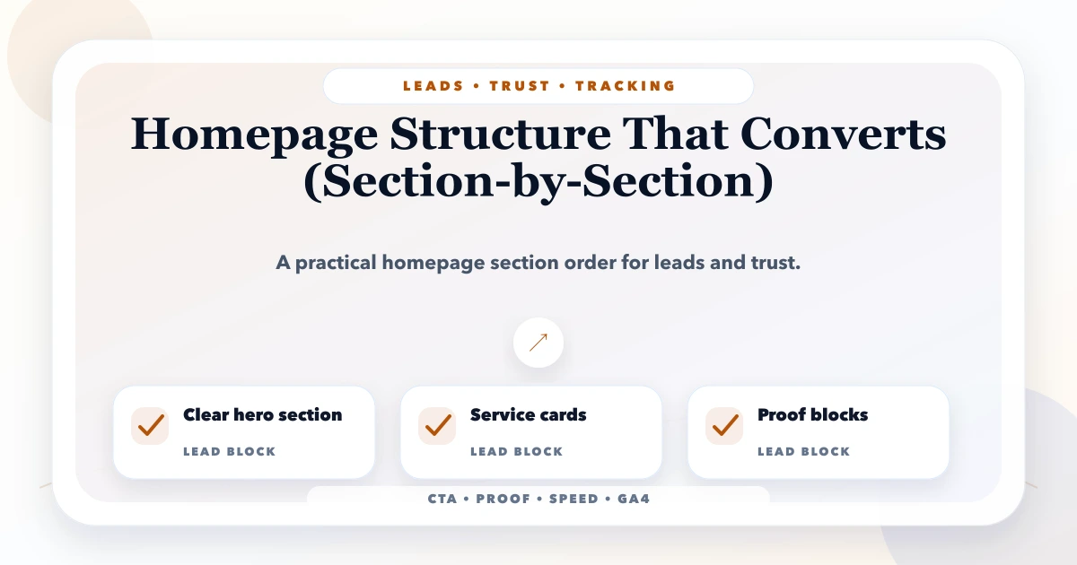
A homepage does not need to explain every service in equal detail. It needs to help the right visitor answer four questions quickly: what the company does, whether it handles my problem, why I should trust it, and what I should do next.
Conversion does not mean adding more buttons. A homepage converts when the offer, evidence, navigation, and next step stay coherent from the search result to the enquiry. This section-by-section plan is for service businesses that sell considered work such as websites, software, consulting, automation, or implementation.
Use this practical sequence:
The order can change based on search intent. What matters is that each section earns the next scroll or click.
A homepage may need to serve branded visitors, referrals, local search users, potential partners, job seekers, and existing customers. Do not write one vague paragraph for all of them. Pick the primary commercial audience and provide navigation for secondary audiences.
Write a one-sentence job statement:
Help Indian SMEs understand which VASUYASHII service or product fits their operational need and start a qualified conversation or live product trial.
This is more actionable than “create a modern digital presence.” It gives the team a basis for deciding what stays above the fold and which sections are secondary.
The header should expose the main paths without behaving like a sitemap. Use familiar labels: Services, Products, Demos, Blog, About, and Contact when those destinations exist. Keep the current page visible and make mobile navigation keyboard and screen-reader usable.
A primary header CTA should describe the action, such as “Contact Us,” “Request a Demo,” or “Try Live Demo.” Do not create several visually equal CTAs. Product trial and project enquiry can be separate only when their destinations are clearly different.
The hero should contain:
Avoid headlines built only from words such as “innovate,” “transform,” or “excellence.” They do not help a visitor decide whether the business builds websites, web apps, mobile apps, integrations, or business software.
For VASUYASHII, a strong hero should make software, websites, and business automation visible while routing product buyers toward Business Suite and project buyers toward contact. Keep the hero readable without waiting for animation; motion may enhance the background but should not delay the largest text element.
Visitors should not interpret an internal service taxonomy. Present choices through business outcomes:
| Visitor need | Route |
|---|---|
| Get a lead-focused business website | Website/service page |
| Build a dashboard, portal, or workflow | Web applications |
| Replace a specific manual process | Software development |
| Connect payments, WhatsApp, CRM, or APIs | Integrations |
| Manage GST billing and inventory | VASUYASHII Business Suite |
Each summary should link to a detailed page. The homepage introduces; dedicated pages answer scope, process, fit, and objections. Use the services overview as the main service router.
Proof must be current and honest. If an old portfolio is no longer representative, do not display it only to fill space. Better evidence can include:
Avoid invented project counts, growth percentages, partner logos, or unnamed testimonials. One working Business Suite demo can carry more trust than many generic mock projects.
Explain the before-and-after state without guaranteeing results. Examples:
Pair each outcome with the service that enables it. This helps visitors self-select and creates contextual internal links.
Use four to six service summaries with a clear purpose, example deliverables, and “view details” link. Avoid repeating the same phrase across every card.
For example:
The homepage should not claim every possible technology. Detailed pages can describe fit, constraints, and current capability.
When a company has a sellable product, give it a distinct section rather than hiding it inside service cards. For VASUYASHII Business Suite, the section can state its real positioning: GST billing, inventory, purchases, payments, expenses, reports, PDF invoices, secure WhatsApp sharing, multi-company support, and role-based access for Indian SMEs.
Also state boundaries. It should not be presented as a complete SAP/Odoo-class enterprise ERP or full accounting replacement when those modules are not included. Link to the product page and live trial; label sample credentials clearly and avoid exposing privileged accounts.
A concise process reduces buyer uncertainty:
Do not promise a free custom demo for every enquiry unless the team can sustainably deliver it. Explain what the first call produces and when a prototype is appropriate.
Industry demos help visitors visualise structure, but they must be labelled as sample concepts rather than completed client work. Show a small selection and link to the full demo collection. Use descriptive titles and accessible images.
If a demo has interactive functionality, state what is simulated. The homepage should not load every demo's heavy assets; use optimised previews and lazy-load below the fold.
FAQs should answer sales questions that are not covered above:
Avoid filling FAQs with exact-match keywords. Use concise, specific answers and link to a detailed service page where necessary.
The final section should repeat the next action with a clear expectation. A good project CTA asks the visitor to share the business problem, current process, users, required timeline, and existing systems. A product CTA routes to the live demo and then to setup contact.
The contact form should confirm success, prevent obvious spam, and record a generate_lead event only after valid submission. Phone and WhatsApp links can record separate intent events. Never send personal form fields into analytics.
Use a simple pattern:
This prevents sections made only of headings and icons. It also makes it easier to review unsupported claims.
Mobile design is not the desktop page stacked vertically. Reorder or simplify secondary content while preserving the commercial decision path.
The homepage usually carries more scripts and visual effects than other pages. Protect the first viewport:
Use the website speed optimisation guide for a deeper checklist.
The homepage should link to the strongest commercial destinations, not dozens of similar blog posts. Keep one self-canonical final URL, page-specific Open Graph data, organisation/website structured data, and a descriptive title and meta description.
Link naturally to priority hubs such as website development in Delhi NCR, web application development, custom software, CRM and ERP, and local SEO. Blog posts support these hubs rather than competing with them.
Measure decisions, not decorative interaction:
Do not judge the homepage from bounce rate alone. A visitor may find the phone number and leave successfully. Combine engagement, action, and lead-quality evidence.
The hero becomes unreadable. State the umbrella offer and route visitors to focused pages.
Old or irrelevant work can reduce trust. Use current demos, product evidence, process, and verified reviews instead.
Too many equal buttons weaken hierarchy. Place actions at genuine decision points.
Text and links should remain accessible and visible if motion fails or is reduced.
Avoid guaranteed ranking, unsupported revenue results, and invented counts.
Connect generate_lead to successful form submission and compare with CRM outcomes.
Use as many as the buying decision needs, not a fixed count. Most service homepages need offer, routes, proof, process, objections, and a clear contact action.
It depends on traffic. Referrals may need service clarity; cold visitors may need early evidence. Test the sequence against real behaviour.
Use pricing cues or starting scope only when they are accurate. Complex projects usually need discovery before a responsible quote.
Usually one strong message is easier to understand and measure. Sliders can hide content and add performance or accessibility costs.
Use current working demos, product screenshots, verified reviews, transparent process, and honest capability evidence.
Track qualified route clicks, valid leads, lead quality, mobile behaviour, and performance over time. Do not use one aggregate metric alone.
Use the service-page content guide and above-the-fold design guide to refine individual sections. For a homepage rebuild, review web application services or share the current URL and business goal.
Related Articles
April 26, 2026
Software demo page that converts: page structure, pricing, proof blocks, CTA flow, tech stack, and launch checklist for better leads.
Read article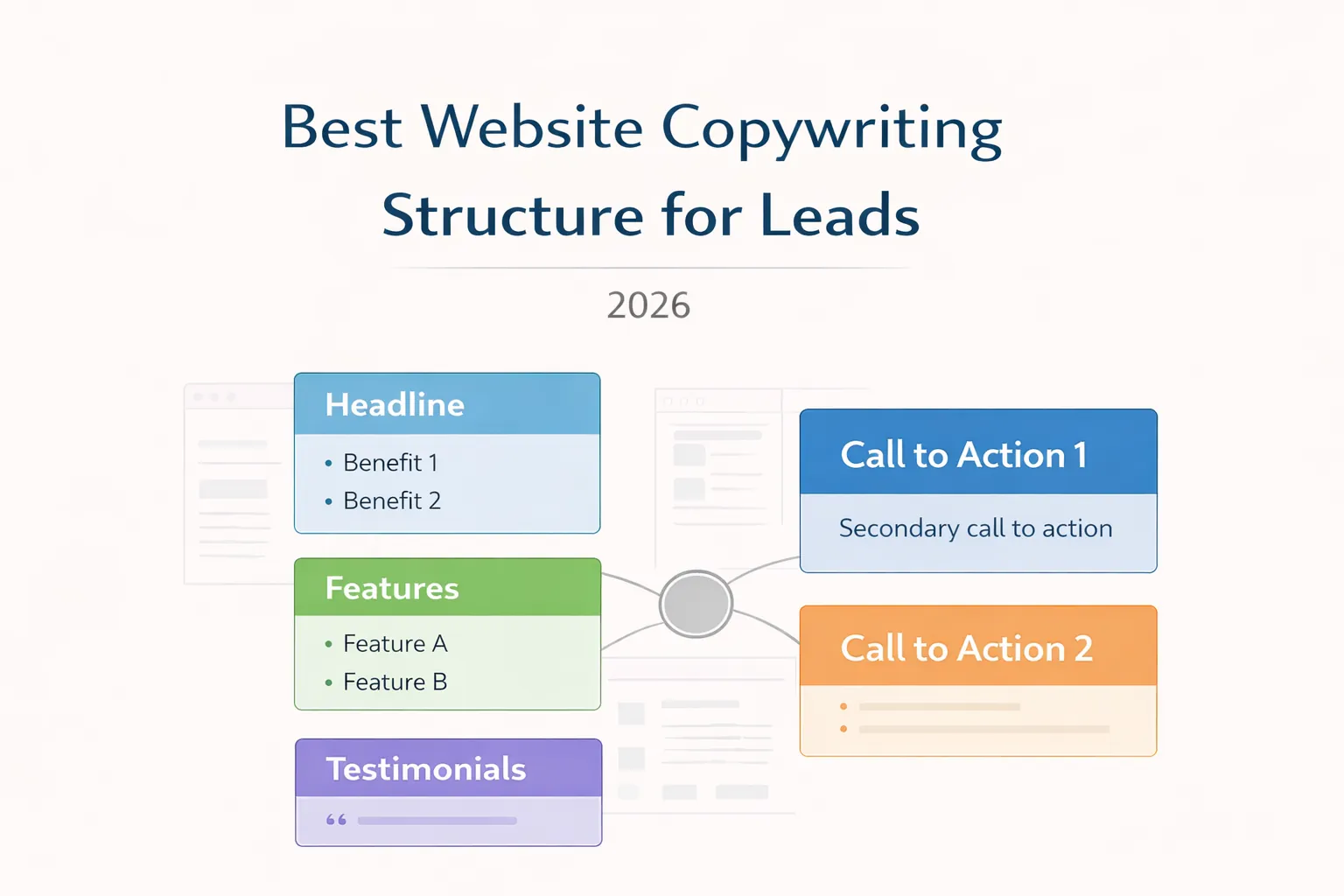
March 29, 2026
Write website copy for better leads using clear positioning, customer language, proof, objection handling, qualification and measurable calls to action.
Read article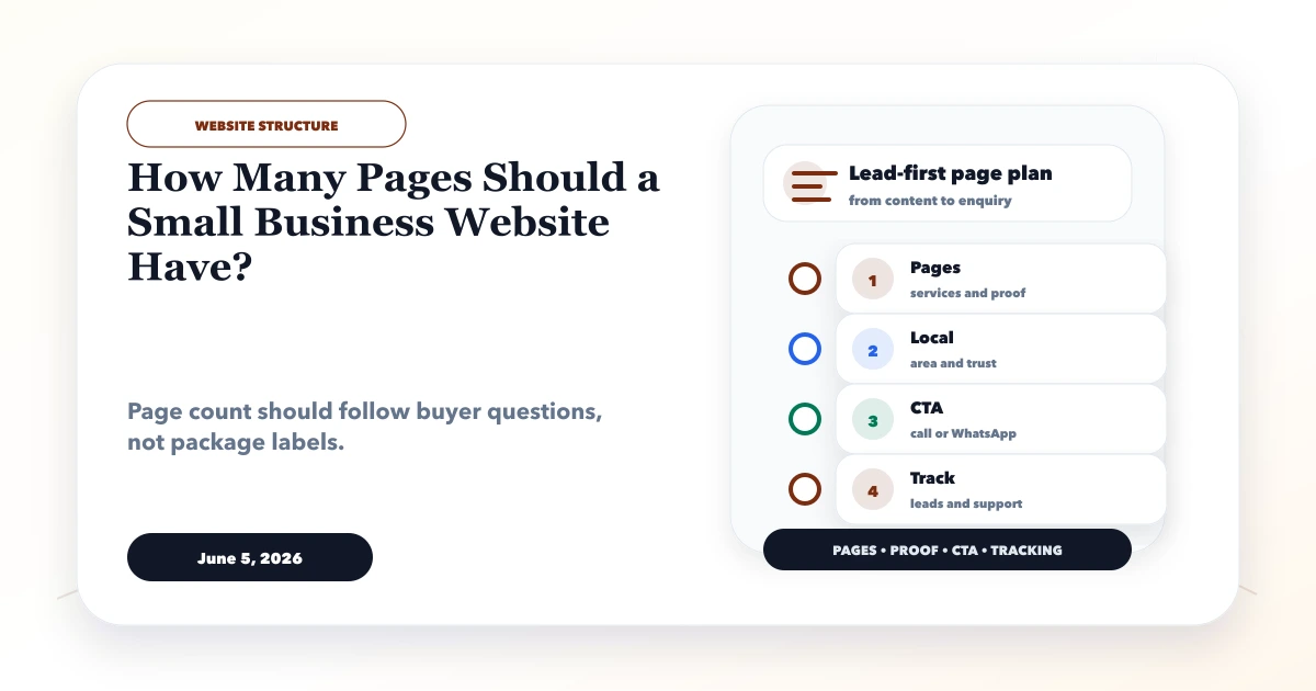
June 5, 2026
Choose the right number of small business website pages using service intent, buyer questions, SEO value, content ownership, budget, and expansion plans.
Read article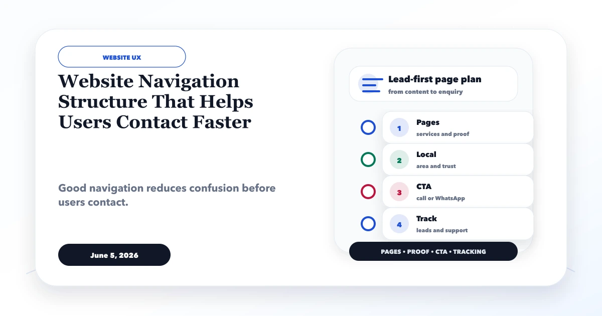
June 5, 2026
Design website navigation that helps visitors compare services, find proof, understand next steps, and contact the business quickly on desktop and mobile.
Read article