
May 21, 2026
Website Copy That Converts for Service Businesses
Write service-business website copy with clear buyer intent, proof, scope, objections, pricing context, useful CTAs, SEO structure and conversion measurement.
Read articlePublished Updated
Use practical homepage hero formulas for service businesses with clear audience, offer, proof, CTA hierarchy, mobile layout, and conversion tracking.
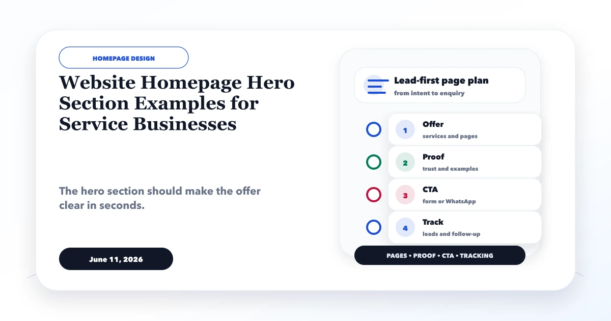
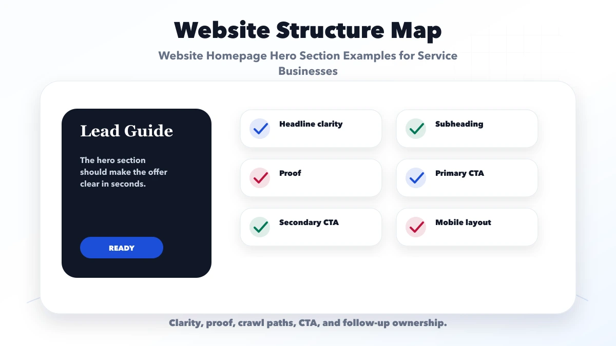
The best website homepage hero section examples are not clever slogans. They help a visitor identify the service, audience, fit, proof, and next action within the first screen. For a service business, clarity usually matters more than visual novelty.
A hero section cannot answer every objection. Its job is to make the visitor continue with confidence or take the correct primary action.
By Tushar C. (Founder, VASUYASHII). Reviewed for lead-first information hierarchy, mobile usability, claim safety, accessibility, and analytics. The examples are copy frameworks, not claims about fictional clients.
A service-business hero should usually contain:
Remove any element that competes with the main decision without adding trust.
Ask a person unfamiliar with the business to look at the first screen for five seconds. Can they answer:
If the answer depends on scrolling, guessing, or interpreting a slogan, rewrite the hero before adding animation.
Use this structure as a starting point:
Headline: [Service or category] for [specific audience or operating need]
Subheading: We help [audience] achieve [practical outcome] through [scope/process], with [credible boundary or differentiator].
Primary CTA: A direct command tied to the next step.
Proof line: One verifiable fact, process, capability, or evidence link.
The formula is intentionally plain. Design can add character after the message works.
Headline: Business websites designed for qualified enquiries
Subheading: Plan service pages, proof, forms, WhatsApp, analytics, and handover around the questions your buyers ask before contacting you.
Primary CTA: Discuss your website plan
Secondary CTA: View project evidence
Proof: Link to real services, not an unsupported “500+ clients” counter.
Why it works: the copy separates a lead-first business website from a visual-only design service and sets expectations about the planning scope.
Headline: Tax and compliance support for growing businesses
Subheading: Get clear guidance on registrations, filings, and recurring compliance from a team that explains required documents and next steps.
Primary CTA: Book an initial consultation
Secondary CTA: View services
Proof: Use actual qualifications, memberships, office details, service process, or approved testimonials. Do not claim guaranteed tax savings.
Headline: Commercial renovation and maintenance across your real service area
Subheading: Review relevant project scope, coverage, site-visit process, and quote requirements before speaking with the estimating team.
Primary CTA: Request a site assessment
Secondary CTA: View similar projects
Proof: Show a structured project with genuine scope and images. The contractor website guide explains the evidence model.
Headline: Exam-focused coaching with current batch and counselling details
Subheading: Compare course fit, faculty, schedule, fee inclusions, and evidence before booking counselling for the correct attempt year.
Primary CTA: Check the next batch
Secondary CTA: Book counselling
Proof: Use attributable faculty and result information. Avoid guaranteed ranks or scores.
Headline: Custom packaging produced to approved specifications
Subheading: Explore materials, print options, MOQ factors, applications, and the technical details required for a quote-ready RFQ.
Primary CTA: Submit an RFQ
Secondary CTA: Browse capabilities
Proof: Use real specifications, equipment/process evidence, certificates, and product images within their approved scope.
Headline: GST billing, inventory, and business management for Indian SMEs
Subheading: Create invoices, track stock, record purchases and payments, manage expenses, and share PDFs from one practical ERP-lite platform.
Primary CTA: Try the live demo
Secondary CTA: Review features
Proof: A real product walkthrough is stronger than a decorative dashboard mockup. The VASUYASHII Business Suite page uses an accessible demo and clearly states current scope rather than positioning it as a full enterprise ERP.
Brand-only headlines can work for famous companies. Smaller service businesses benefit from naming what they do.
“Better decisions from weekly operational reports” is more specific than “Transform your future.” Do not promise an outcome the service cannot control.
“Inventory software for wholesalers” helps the right visitor self-select. It also reduces enquiries from audiences the product does not serve.
Words such as best, leading, award-winning, affordable, and trusted need evidence. Replace them with scope, process, or proof.
One CTA should be visually primary. Choose it from the real sales process:
| Visitor readiness | Suitable action |
|---|---|
| Ready to discuss | Request a quote / Book a call |
| Comparing options | View projects / See features |
| Needs fast clarification | Ask on WhatsApp |
| Evaluating software | Try live demo |
| High-consideration service | Book diagnostic / Site assessment |
Do not give “Contact,” “Book,” “WhatsApp,” “Call,” “Learn,” and “Download” equal visual weight. Too many choices delay action.
The CTA label should explain the next step. “Request a scoped estimate” is more informative than “Get started.”
Useful proof can be:
Do not use fabricated logos, review text, metrics, or “live activity” counters. If proof is not yet available, use transparent process rather than invented popularity.
Choose a visual that helps inspection. A software company should show the real interface. A contractor can show a relevant completed project. A consultant can use a meaningful decision tool, team image, or working session. A cafe should show its actual space or menu item.
Avoid dark atmospheric stock photos that hide the subject. Decorative motion must not reduce text contrast, cause layout shift, or continuously consume resources on mobile.
On a narrow screen:
Do not force desktop-scale typography onto mobile. The headline should remain prominent but readable.
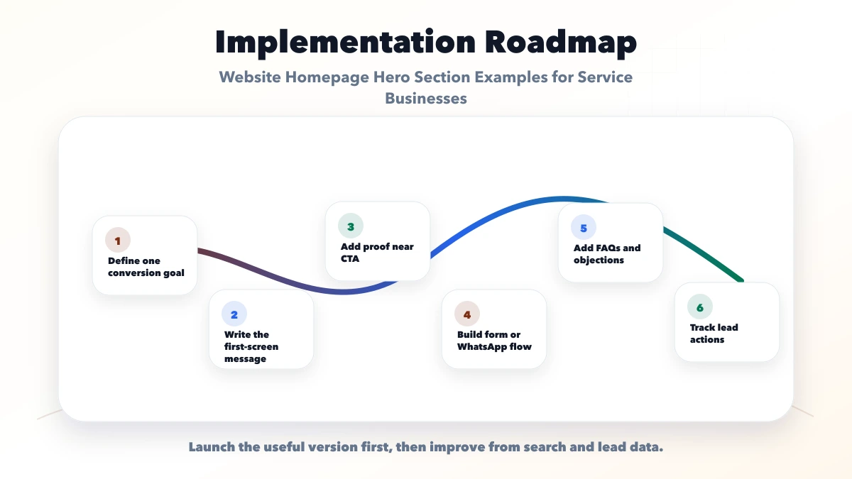
Track actions that correspond to business decisions. On the VASUYASHII website, the current privacy-safe event vocabulary includes contact_click, whatsapp_click, demo_open, and generate_lead. That keeps reporting tied to specific actions instead of a vague “engagement” number.
For another business, define equivalent events and capture the source page and CTA position. Compare:
Do not declare a winning hero from click-through rate alone. Lead quality and completion matter.
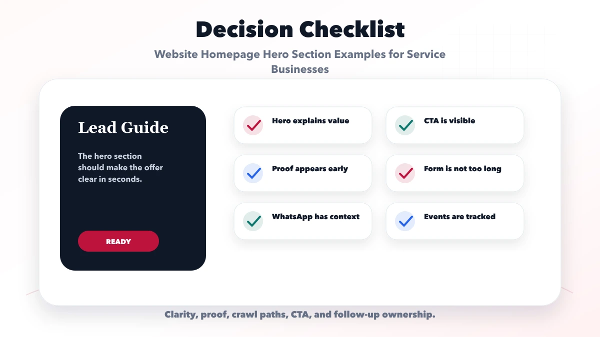
It uses the most valuable copy position without explaining the offer.
Move detailed features lower. The headline should orient the visitor.
Replace unsupported counters with real projects, process, or scope.
“View demo” should open a demo, not a general contact form. “Request quote” should prepare the visitor for required details.
Background effects should never create flicker, hide text, or degrade mobile performance. Message and layout come first.
Use the shortest wording that identifies category, audience, or outcome. A two-line headline is acceptable when it remains easy to scan on mobile.
Use an embedded form only when the first action is simple and low-risk. High-consideration services usually benefit from a focused CTA leading to a better qualification flow.
It can be for mobile-first local services. Use a contextual prefilled message and keep a structured form for requirements that need more detail.
Show it when price is stable and central to qualification. Otherwise communicate the package or quote model and link to detailed pricing context.
Change it when the offer, audience, proof, or measured lead quality gives a reason. Frequent unmeasured redesigns destroy useful comparison data.
Yes. VASUYASHII can review information hierarchy, copy, responsive layout, CTA destinations, and analytics as part of a scoped website project.
Write the service, audience, proof, and next step before choosing animation or decorative treatment. A clear hero can be visually distinctive without becoming difficult to use.
Related Articles
May 21, 2026
Write service-business website copy with clear buyer intent, proof, scope, objections, pricing context, useful CTAs, SEO structure and conversion measurement.
Read article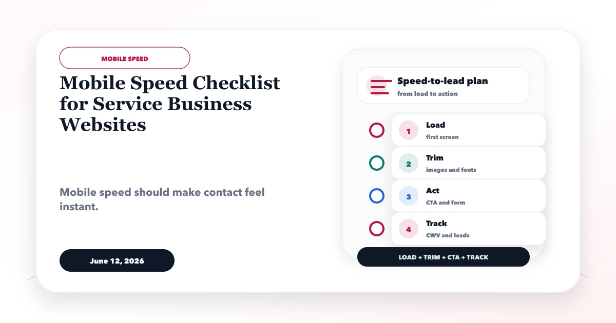
June 12, 2026
Use this mobile speed checklist to improve Core Web Vitals, hero rendering, images, fonts, forms, analytics, WhatsApp CTAs, and real-device UX.
Read article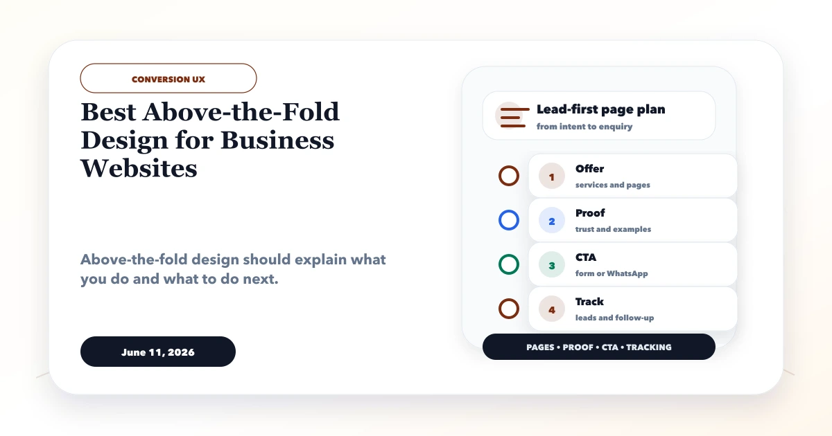
June 11, 2026
Plan an effective above-the-fold section with a clear offer, proof, primary CTA, mobile hierarchy, page-speed safeguards, and practical conversion tracking.
Read article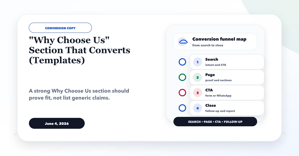
June 4, 2026
Write a credible Why Choose Us section using specific fit, proof, process, ownership and risk reduction. Adapt six practical templates without vague claims.
Read article