
May 11, 2026
Best Landing Page Structure for WhatsApp Leads
landing page structure for WhatsApp leads: practical 2026 guide with structure, pricing, checklist, mistakes, FAQs, tracking tips, and next steps for Indian.
Read articlePublished Updated
Plan a service website layout with clear offer, local fit, proof, process, pricing context, mobile call and WhatsApp CTAs, forms and conversion tracking.
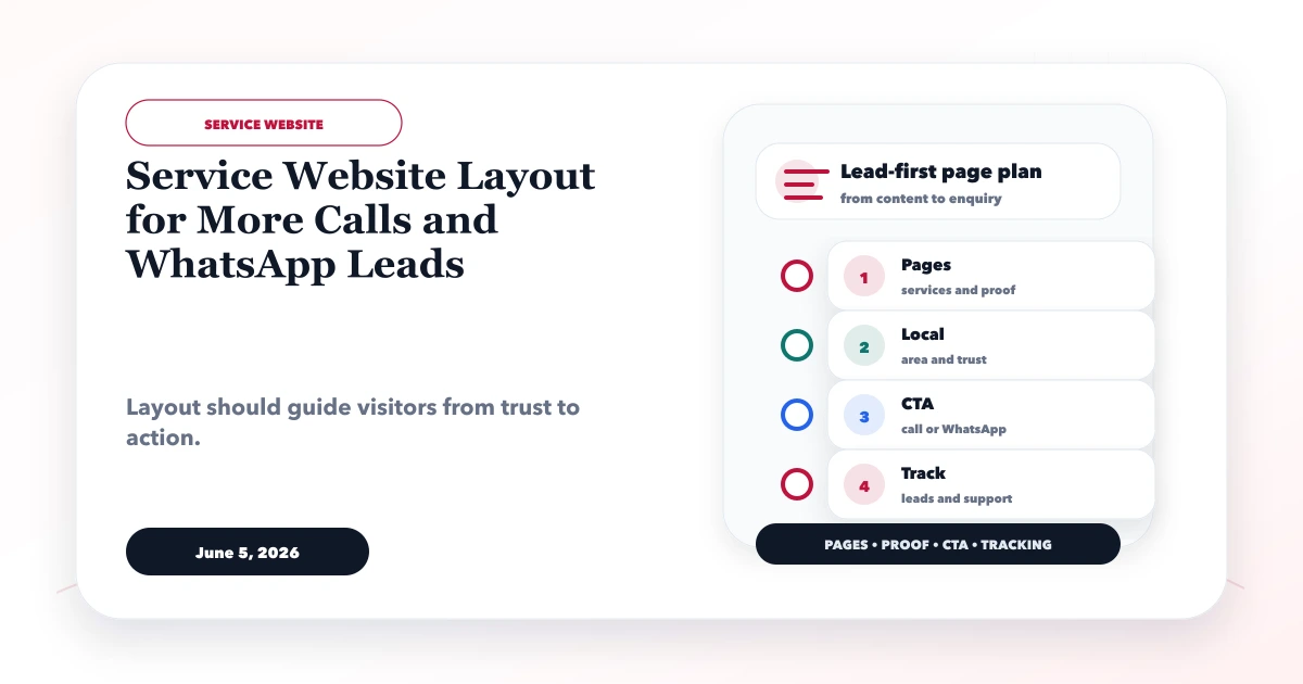
A lead-focused service website should help a visitor answer five questions quickly: Is this the service I need? Does the business serve my situation or area? Is the provider credible? What will happen after contact? Which contact method is easiest right now?
The layout controls when those answers appear. More buttons cannot rescue a vague offer, and a long page is not automatically persuasive. Arrange sections around the buyer's decision and make call, WhatsApp and form paths measurable without covering content on mobile.
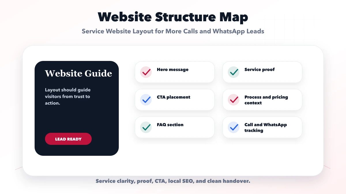
| Section | Buyer question | Primary content |
|---|---|---|
| Hero | Am I in the right place? | Literal service, buyer/area, outcome, CTA |
| Fit strip | Is this relevant to me? | Business types, problems or use cases |
| Proof | Can I trust the claim? | Genuine review, demo, process or current product |
| Service scope | What is included? | Deliverables, boundaries, options |
| Process | What happens next? | Discovery, quote, delivery and handover |
| Cost/timeline | Is this realistic? | Drivers, ranges or quote requirements |
| Objections | What could block the decision? | Focused FAQs |
| Contact | How do I proceed? | Form, WhatsApp, phone and expectation |
This is a starting structure, not a universal template. A clinic may need booking and practitioner proof; a repair service may prioritise area, response time and job process; a consultant may require expertise and diagnostic-call context.
The first screen should include:
Avoid headlines such as “We transform your digital future.” Use a literal service and value proposition. Supporting copy can explain how the service helps.
Choose one primary CTA based on team capability:
Do not present all actions with equal visual weight. The secondary action can be a plain text link or quieter button.
Help visitors self-select. Name real use cases:
This section improves lead quality by clarifying who the offer is and is not for. Avoid claiming suitability for every industry.
Proof should appear near the claim it supports. Options include:
Do not present demos as client work. Do not retain outdated portfolio claims. A proof block should state what the viewer is seeing and what it does not prove.
For VASUYASHII, demo websites are labelled sample concepts, while VASUYASHII Business Suite is current product evidence.
Use a deliverable-oriented section rather than vague benefit cards:
| Include | Clarify |
|---|---|
| Page or module list | Exact count and purpose |
| Mobile behaviour | Target devices and contact controls |
| Content responsibility | Who supplies copy, images and approvals |
| Lead capture | Form fields, WhatsApp message, phone path |
| SEO foundation | Metadata, canonical, sitemap, crawlability |
| Tracking | Events and success rules |
| Handover | Access, source, deployment and support |
Also list important exclusions. A business website does not automatically include CRM, booking, payment, API automation, content production or monthly SEO.
Show a realistic workflow:
Explain customer dependencies such as content approval, credentials and feedback. This prevents “two-week website” promises from ignoring delayed inputs.
Exact fixed pricing is useful only when the package is standard. Otherwise explain:
Use the website cost-driver guide to prepare the comparison. Pricing context filters mismatched leads even when a final quote requires discovery.
A WhatsApp CTA should preserve useful context:
Hi VASUYASHII, I am planning a five-page website for a local service business. Please help me confirm scope and timeline.
Rules:
The SEO and WhatsApp lead-system guide covers the wider follow-up process.
Use a real tel: link on supported devices and display the readable number nearby. For local urgent services, phone may be primary. For complex software projects, a form or WhatsApp requirement may preserve more context.
Do not state “24/7” unless calls are actually answered. Track phone_click as intent, not a completed call.
Ask only what changes the first response:
Avoid ten mandatory questions before the business has earned trust. Validate on client and server, show clear errors, prevent duplicates and fire a lead event only after accepted submission.
The final contact block should explain:
This reduces empty “price?” messages and sets a professional next step.
Test at narrow widths with real long content:
Use a bottom action bar only when it remains stable and does not conflict with browser UI or accessibility.
Track:
whatsapp_click;phone_click;generate_lead;The conversion tracking guide explains the event contract. Do not send names, phone numbers, emails or free-text requirements to GA4.
A Ghaziabad equipment-maintenance company serves factories across a genuine radius. Its useful page may prioritise:
A copied city page for every nearby location would be weaker than one accurate regional page with real service evidence.
VASUYASHII's homepage and service pages use literal service positioning, responsive contact actions, final-www metadata, GA4 contact/WhatsApp/phone/demo events and a validated contact-form lead event. Current demos are labelled as demos, and the retired public portfolio no longer presents outdated work.
These are implementation facts, not proof of a guaranteed conversion rate. Performance must be evaluated using qualified lead outcomes after deployment.
Place it after the offer is understandable in the hero, then repeat it after proof or decision content. Avoid inserting a button after every paragraph.
WhatsApp is lower friction; forms capture structured requirements. Many service businesses should offer both and measure qualified outcomes.
Show fixed package prices when assumptions are standard. Otherwise publish realistic drivers, ranges or what is required for a quote.
Create one strong page for each genuinely distinct commercial intent. Do not split minor keyword variations into near-duplicate pages.
Only when the additional content resolves buyer questions. Length without hierarchy or proof creates more friction.
Clarify the hero, proof, scope and CTA path before adding animations or new traffic.
Sketch the page as buyer questions and place one evidence block beside each major claim. Then use website development services or contact VASUYASHII for a focused scope.
Related Articles
May 11, 2026
landing page structure for WhatsApp leads: practical 2026 guide with structure, pricing, checklist, mistakes, FAQs, tracking tips, and next steps for Indian.
Read article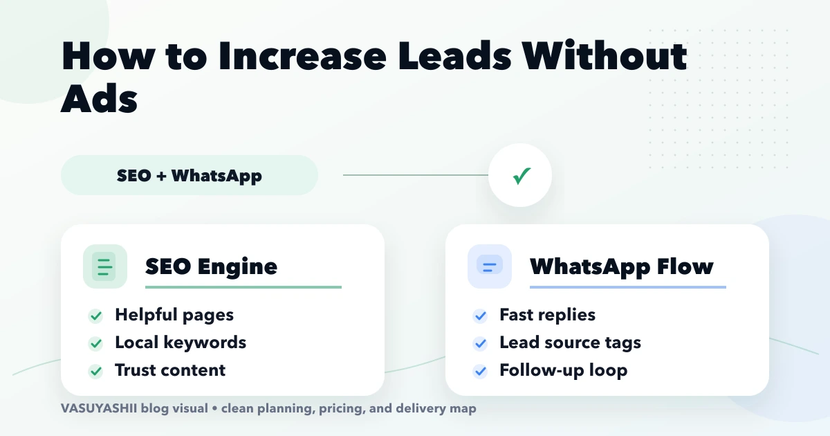
April 16, 2026
Connect SEO and WhatsApp lead generation with focused service pages, useful content, local proof, tracked conversations and a practical 90-day plan.
Read article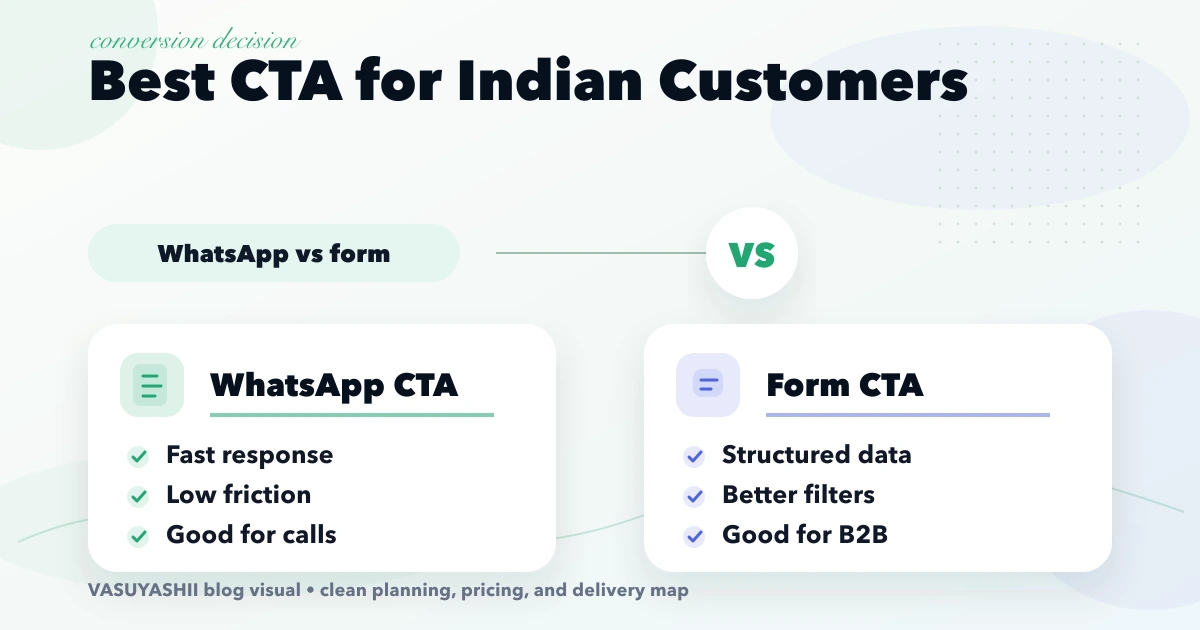
April 18, 2026
Choose between WhatsApp, forms, and calls using buyer intent, requirement complexity, response ownership, consent, mobile UX, tracking, and lead quality.
Read article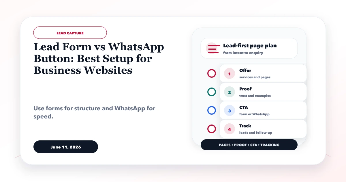
June 11, 2026
Compare lead forms and WhatsApp using intent, qualification, response ownership, spam control, privacy-safe tracking, and practical setup rules.
Read article