
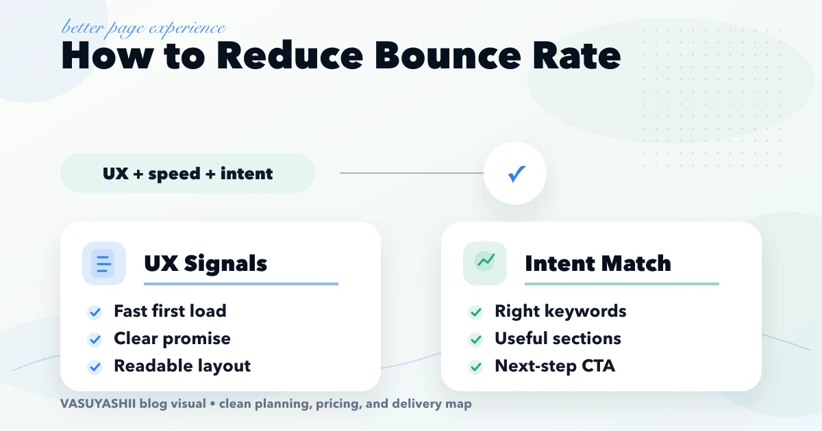
April 18, 2026
Reduce Bounce Rate: Fix UX, Speed, and Intent
Diagnose weak engagement by query, device, and page type; then improve intent match, first-screen clarity, speed, proof, navigation, and CTA tracking.
Read articlePublished Updated
Choose website fonts that protect speed, readability and trust. Compare font files, weights, fallbacks, mobile legibility and loading strategy.
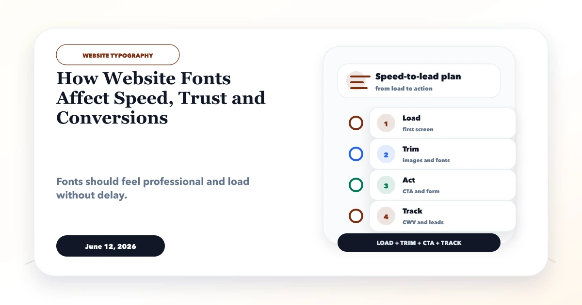
Website fonts affect much more than visual style. They influence how soon users see text, whether headings move after loading, how quickly a price or form label can be scanned, and whether the business feels credible. A decorative font may look distinctive in a mockup but become tiring on a low-cost Android phone. A large font family may also add downloads that delay the first useful screen.
The practical goal is not to find one universally “best” font. It is to select a small type system that fits the brand, reads clearly on real devices, and loads without becoming a bottleneck. This guide explains that decision for Indian service businesses, ecommerce stores, clinics, manufacturers, SaaS products, and other lead-focused websites.
For most business websites, start with one well-made family or a system-font stack, use two or three required weights, keep body text comfortably readable, and test the exact pages on mobile. Add a second family only when it creates a useful hierarchy that cannot be achieved with weight, size, or spacing.
| Decision | Safer starting point | Risky pattern |
|---|---|---|
| Families | One family, optional accent family | Three or more decorative families |
| Weights | Regular, medium, bold | Loading every available weight |
| Format | Modern compressed web format | Large legacy font files |
| Body copy | Neutral, high-legibility face | Display font used for paragraphs |
| Loading | Defined fallback and render policy | Invisible text until font arrives |
| Testing | Mobile, slow network, zoom, Hindi/English if used | Desktop screenshot approval only |
Typography should be treated as a product decision. The design, frontend implementation, content language, and performance budget need to agree.
A custom font is a resource. The browser must discover its declaration, request the required file, download it, and decide what to render while it is unavailable. Too many families, character sets, weights, and styles increase the number or size of those requests.
Common causes include:
Google's web performance guidance explains that web fonts can delay text rendering and that swapping between dimensionally different fonts can contribute to layout movement. Its font best-practices guide is a useful technical reference, but the implementation still needs measurement on the actual website.
A smaller file can still be delivered badly. Check the complete loading path:
Blindly preloading every font is not optimization. It can compete with the hero image, stylesheet, or other important resources. The web font loading guide describes preload and font-display; use them selectively after examining the network waterfall.
Users do not normally identify a typeface by name. They experience the result: easy or difficult reading, coherent or inconsistent hierarchy, and professional or careless spacing.
Trust usually improves when:
Trust falls when text is tiny, unusually thin, crowded, clipped, or visually inconsistent between pages. A premium-looking serif may suit an advisory firm but feel wrong inside a dense inventory dashboard. A geometric display face may work for a hero heading but perform poorly in terms and conditions or invoice tables.
Conversion is a sequence of comprehension. The visitor must understand the offer, compare details, notice proof, interpret the next action, and complete it. Fonts can interrupt any part of that sequence.
Examples:
Typography cannot repair a weak offer, but it can stop a good offer from being understood. Pair this review with the website CTA guide and contact-page conversion guide.
Prioritise fast headings, readable service explanations, prominent contact actions, and clean proof. One family with clear weight contrast is often enough.
Test product names, prices, discount labels, variant selectors, delivery details, and long review text. Numbers must align and remain distinct at small sizes.
Dense tables, filters, totals, statuses, and forms need a neutral UI face. Consistent numeral width can improve scanning. Decorative brand typography should stay outside operational data.
A display or serif heading can create personality, but long advisory content should use a comfortable reading face. Authority comes from restraint and evidence, not ornate typography alone.
Verify the actual script coverage and visual balance. A Latin heading and Devanagari body must not feel like unrelated products. Test mixed lines containing names, dates, rupee amounts, and punctuation.
Desktop approval is insufficient because mobile introduces narrower lines, touch targets, device scaling, bright outdoor use, and variable network conditions.
₹1,25,000 remain clear.The mobile-friendly website guide provides a broader responsive review beyond type.
Do not start by changing the font. Capture evidence first.
List every family, file, weight, style, and source. Record where each is used. Browser developer tools and the network panel can reveal files loaded but never visibly required.
Map hero heading, section heading, card heading, body, label, helper text, price, and CTA styles. Similar roles should not have arbitrary differences.
Run a cold mobile test. Inspect First Contentful Paint, Largest Contentful Paint, layout shifts, font requests, cache headers, and render timing. Lab tests diagnose; field data shows what real visitors experience.
Review contrast, zoom, line height, letter spacing, focus states, and form errors. Do not use colour or font weight as the only way to communicate status.
Test representative pages, not only the homepage. Blog articles, policy pages, product details, and forms expose different character and reading needs.
For a wider technical review, use the website speed optimization guide and Core Web Vitals fixes for Next.js.
Consider a hardware distributor whose website loads a premium family in six weights. The homepage also contains a large hero image and WhatsApp CTA. On a slow mobile connection, the custom headline appears late while the button shifts after the font swap.
A sensible correction would be to retain the brand family for two heading weights, use a reliable system or compact body face, remove unused italics, keep the headline fallback close in width, and verify that the CTA remains stable. The objective is not a visually plain website. It is a controlled identity that does not delay the enquiry path.
This is an illustrative scenario, not a reported client result.
VASUYASHII reviews typography alongside the page's actual job. We inspect loaded files, above-the-fold text, mobile wrapping, fallback behaviour, content language, form states, and the elements measured as LCP or affected by layout shift. We then remove unnecessary resources before changing the brand expression.
For a new website, our website development service establishes a small reusable type system. For a web product with tables and workflows, the web application service focuses on dense-data readability and stable controls.
No. A controlled family with a few compact files, good caching, and appropriate loading can perform well. Problems usually come from unnecessary files, late discovery, poor render behaviour, or lack of testing.
No. System fonts are a strong performance option, but brand differentiation may justify a custom face. The decision should compare visual value with delivery and readability cost.
There is no universal number. Many sites can create sufficient hierarchy with regular, medium or semibold, and bold. Load only weights that are visibly used.
Yes. Font delivery can delay visible text or contribute to layout shifts when the fallback and final font differ. Measure the actual LCP element and layout movement before choosing a fix.
No delivery method is automatically optimal for every site. Review the requested files, connection overhead, cache behaviour, privacy requirements, and real transfer timings.
Test headings, paragraphs, forms, buttons, numbers, language coverage, zoom, small screens, cold loading, and fallback rendering. Approval should cover the live experience, not only the design file.
If typography is delaying content or weakening readability, audit the real pages before buying another font or redesigning every section. Contact VASUYASHII for a scoped website performance and UX review.
Related Articles
April 18, 2026
Diagnose weak engagement by query, device, and page type; then improve intent match, first-screen clarity, speed, proof, navigation, and CTA tracking.
Read article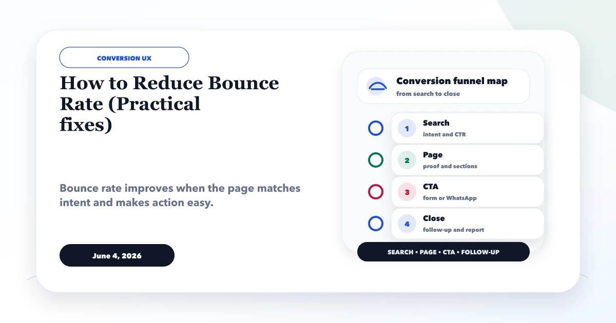
June 4, 2026
Reduce bounce rate by diagnosing search intent, mobile speed, content clarity, CTA friction, and tracking quality instead of chasing one sitewide number.
Read article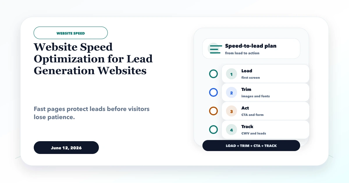
June 12, 2026
Optimize lead-generation website speed by prioritizing the first screen, forms, WhatsApp, images, fonts, JavaScript, tracking and post-launch measurement.
Read article
March 18, 2026
Use this 2026 website speed optimization guide to measure Core Web Vitals, prioritize LCP and script fixes, improve images and fonts, and retest safely.
Read article