Mobile Friendly Website Design Guide (2026): UX, Layout, Speed, SEO & Conversion Best Practices
In 2026, a website is judged mainly by its mobile experience. Even if your desktop version looks premium, you will lose leads if your mobile site is difficult to use. Most people will discover your business through Google, Instagram, or WhatsApp, and then open your website on a phone. If the layout feels confusing, text is hard to read, buttons are too small, or the page loads slowly—users leave quickly.
A mobile-friendly website is not only about “responsive layout.” It’s about mobile UX: how easily a person can read, tap, scroll, and contact you.
This guide is a practical, professional blueprint to design a mobile-friendly website that:
- looks premium
- loads fast
- ranks better on Google
- converts visitors into WhatsApp or form leads

Quick Definition: What Does “Mobile Friendly” Mean?
A mobile-friendly website means:
- content is readable without zoom
- navigation is simple and tap-friendly
- buttons are large enough and spaced well
- forms are easy to fill
- layout does not break or overflow
- pages load fast on mobile networks
Responsive is necessary, but mobile-friendly design is the complete user experience.
If you build fast websites and web applications for businesses, see: Web Applications Services
Why Mobile-Friendly Design Matters So Much in 2026
1) Mobile-first customer behavior
People often research businesses on phone while:
- commuting
- sitting in a shop
- comparing options quickly
- asking on WhatsApp
2) Google strongly values mobile usability
Google evaluates user experience and mobile performance heavily. If users bounce quickly, rankings can suffer.
3) Mobile conversions are different
On mobile, users want:
- quick answers
- quick proof
- quick contact (WhatsApp button)
If your page makes them think too much, they leave.
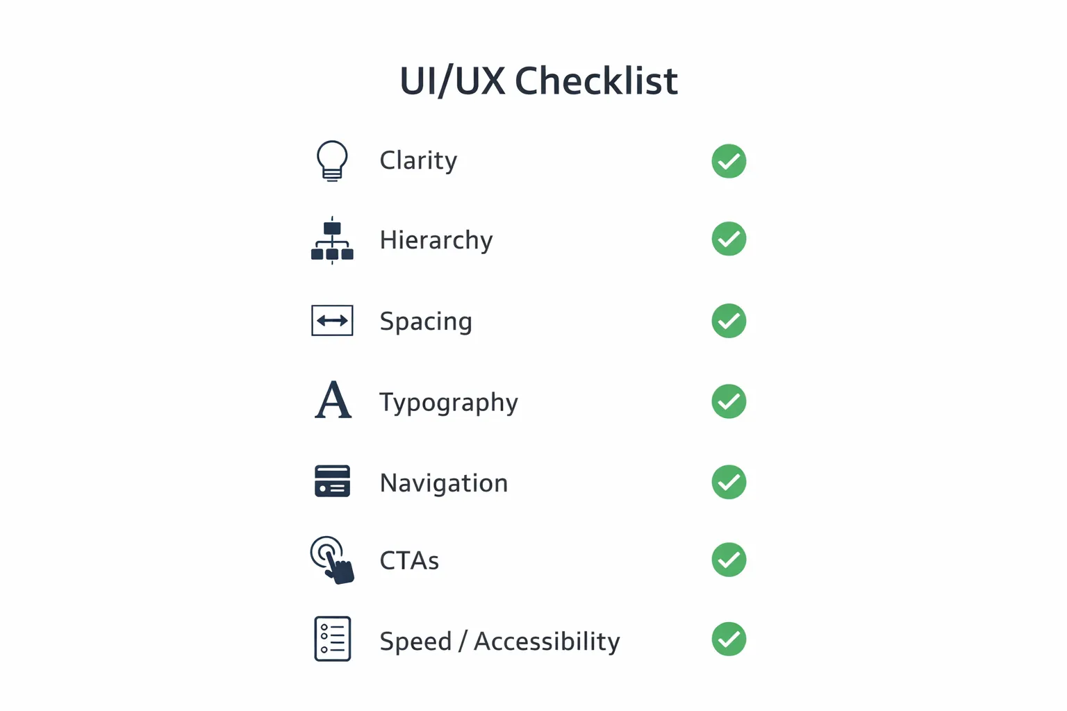
The Mobile-Friendly Website Design Framework (Professional Standard)
A mobile-friendly website has 7 key components:
1) Structure (what appears in what order) 2) Typography (readability) 3) Layout & spacing (comfort) 4) Tap targets (buttons, links) 5) Navigation (menus) 6) Forms (lead capture) 7) Speed (performance)
1) Mobile-First Content Structure (Most Important)
Mobile screen is small. So you must prioritize what the user sees first.
Best homepage order for mobile
1) Clear headline (what you do) 2) 1-line supporting text (who you help + result) 3) CTA buttons (WhatsApp + Contact) 4) Proof section (portfolio/demos/testimonials) 5) Services summary (3–6 cards) 6) Process (3 steps) 7) FAQs 8) Final CTA
What to avoid
- huge hero image pushing content down
- long paragraphs without breaks
- too many sections on top
- hiding contact options
Mobile rule: the first screen should answer: “What is this and what do I do next?”
2) Typography Rules for Mobile (Readability = Trust)
Most mobile websites fail because the text is uncomfortable.
Practical typography rules
- body text should be readable without zoom
- headings should be bold but not oversized
- line-height should be comfortable (no tight lines)
- avoid long line length on desktop, but on mobile ensure good spacing
Common mistakes
- tiny fonts
- thin font weights everywhere
- too many font styles
- long unbroken paragraphs
Tip: Break paragraphs into 2–3 lines maximum for mobile.
3) Spacing & Layout (Premium Feel Comes From This)
A mobile-friendly website feels premium when:
- sections have breathing space
- content is not cramped
- cards have consistent padding
- alignment is clean
Best practices
- consistent spacing scale (small/medium/large)
- use cards for grouped content (services, features)
- maintain consistent margins
Mistakes to avoid
- content touching screen edges
- random padding in each section
- too many tiny elements
4) Buttons, Links & Tap Targets (Conversion Depends on This)
On mobile, tap targets must be large and separated.
Rules that work
- buttons should be tall enough for thumbs
- links should not be too close together
- CTA buttons should stand out
- WhatsApp button must be visible and easy to tap
Common mobile CTA system
- Primary CTA: WhatsApp
- Secondary CTA: Contact page or form
Example WhatsApp CTA: 👉 WhatsApp: Chat on WhatsApp
5) Navigation: Keep It Simple
Mobile navigation should:
- help users reach important pages quickly
- not block the screen
- remain consistent across pages
Mobile menu best practices
- 4–6 primary items max
- keep “Contact” visible
- use a sticky header only if it improves UX
- ensure menu is easy to close
Avoid
- too many menu items
- tiny menu buttons
- complicated dropdowns
6) Forms That Work on Mobile (Lead Capture)
Forms often break conversions on mobile.
Rules for mobile-friendly forms
- keep fields minimal: Name, Phone, Requirement
- big input height (easy to tap)
- use correct keyboard type (number keyboard for phone)
- show clear errors and success messages
- keep button easy to tap
Common mistakes
- long forms with 10+ fields
- tiny inputs
- placeholders as labels (confusing)
- no confirmation message
If your main lead flow is WhatsApp, you can keep forms optional and push WhatsApp first.
7) Images & Media (Mobile Performance + Layout Stability)
Mobile-friendly design is also about how images behave.
Best practices
- use WebP images
- avoid huge file sizes
- keep consistent aspect ratios for cards
- lazy-load images below the fold
- ensure images do not cause layout shifting
Avoid
- very heavy images
- random image sizes inside grids
- images that push content down too much
8) Speed: Mobile-Friendly Websites Must Load Fast
Many websites look good but feel slow. On mobile, speed is essential.
What improves speed
- optimized images (WebP)
- minimal third-party scripts
- clean code
- caching + CDN hosting
- lazy-loading below fold
What makes sites slow
- heavy animation libraries everywhere
- too many trackers/widgets
- unoptimized images
- huge background videos
A fast mobile site feels premium instantly.
9) Mobile-Friendly Design and SEO
Mobile-friendly design improves SEO because:
- user engagement improves
- bounce rate reduces
- pages load fast
- content is readable and structured
- Google sees better usability
SEO is not only keywords. UX matters too.
10) Mobile Conversion Strategy (India Focus)
In India, the fastest conversion usually happens through WhatsApp.
Best mobile conversion flow
1) user reads headline 2) user sees proof (portfolio/demos) 3) user taps WhatsApp button 4) pre-filled message helps conversation start
Include these pages in internal linking:
If you want to show demos:
Mobile-Friendly Checklist (Quick)
Use this before publishing:
- text readable without zoom
- buttons easy to tap
- WhatsApp CTA visible
- forms easy to fill
- menu usable with thumb
- images optimized and not overflowing
- page loads fast on mobile network
- no horizontal scrolling
- spacing consistent
- proof and CTA present above fold
Common Mobile Design Mistakes (And How to Avoid)
1) Desktop design forced into mobile 2) Too much content on first screen 3) Buttons too small 4) Too many popups 5) Slow pages due to heavy media 6) No clear CTA 7) Weak proof (no demos/portfolio)
Final Summary
A mobile-friendly website in 2026 is:
- mobile-first in structure
- readable and clean
- tap-friendly for thumbs
- fast and optimized
- conversion-focused (WhatsApp + proof)
- SEO-ready due to strong UX
When you combine mobile UX + speed + SEO structure, your website becomes a lead engine.
Need a Mobile-Friendly Website That Converts?
If you want a premium mobile-friendly website that loads fast, ranks better, and generates WhatsApp leads, we can build it professionally.
👉 WhatsApp: Chat on WhatsApp 👉 Services: Web Applications Services 👉 Portfolio: View our work 👉 Contact: Contact page
Mobile UX Audit Checklist
A mobile-friendly website should be easy to read, tap, trust, and contact. For Indian business websites, the mobile journey often ends in WhatsApp, call, or a short form, so those actions must be visible and fast.
Check these before launch:
- headline fits the first screen
- CTA is visible without confusion
- tap targets are comfortable
- forms are short and keyboard-friendly
- images are compressed and stable
- menu is simple
- proof appears before users lose interest
For service websites, mobile UX should be checked alongside web application services, conversion tracking, and contact flow.
Mobile Design Mistakes
- Designing desktop first and shrinking later.
- Using tiny buttons or long forms.
- Loading heavy images above the fold.
- Hiding WhatsApp or call actions too low.
FAQs
1) Is responsive and mobile-friendly the same?
Responsive means layout adapts. Mobile-friendly means the full mobile UX is comfortable: text, buttons, forms, speed, and navigation.
2) What is the most important part of mobile-friendly design?
Clarity and conversion: clear headline, proof, and easy WhatsApp/contact CTA.
3) Does mobile-friendly design affect SEO?
Yes. Mobile usability and performance strongly influence rankings and engagement.
4) How many CTAs should a mobile page have?
At least 2–3: one above the fold, one mid-page, and one at the end.
5) What is the best mobile CTA in India?
WhatsApp is the highest converting CTA for most service businesses.