
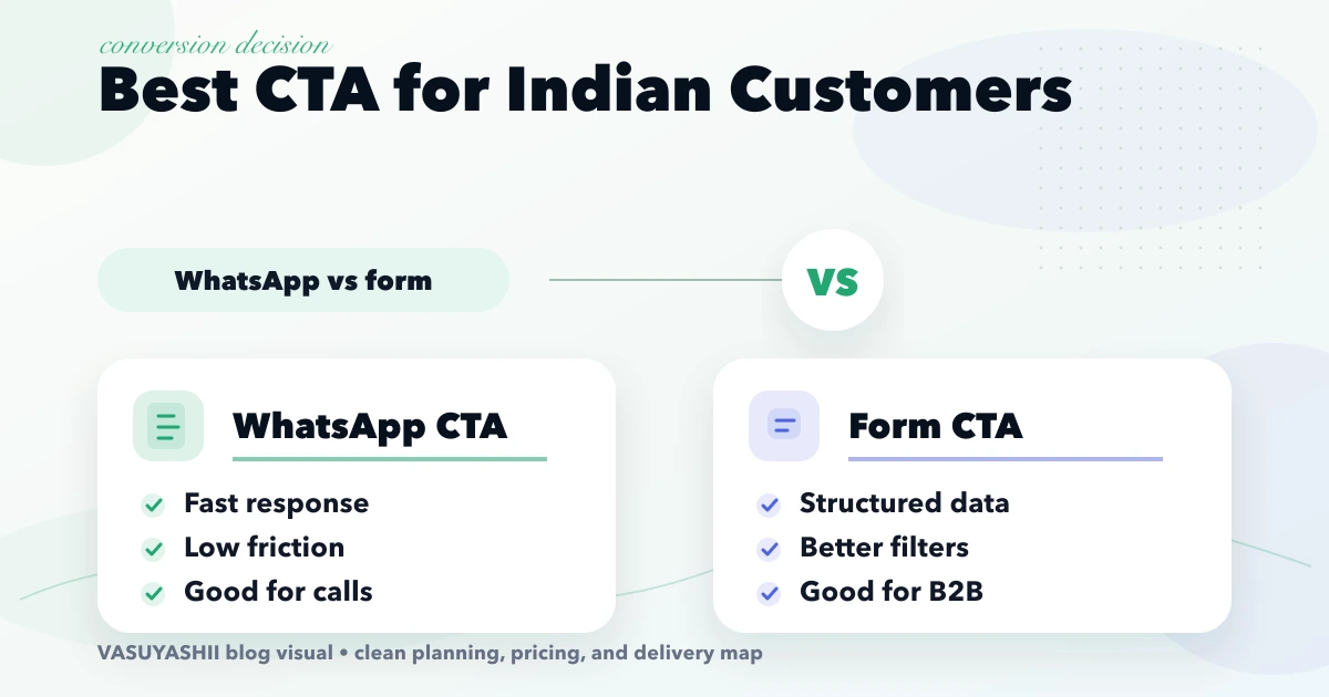
April 18, 2026
Best Website CTA in India: WhatsApp vs Form
Choose between WhatsApp, forms, and calls using buyer intent, requirement complexity, response ownership, consent, mobile UX, tracking, and lead quality.
Read articlePublished Updated
Design website CTAs for Indian businesses using buyer intent, action clarity, WhatsApp, calls, forms, placement, proof, mobile UX, tracking, and lead routing.
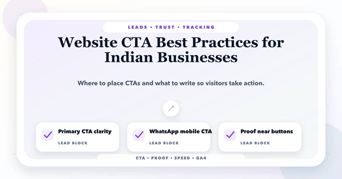
A website call to action should tell the visitor what they can do next, what will happen after they act, and why the action is appropriate at that point in the decision. “Submit” and “Learn More” are not automatically wrong, but they often hide the outcome.
Indian service businesses commonly use phone calls, WhatsApp, forms, booking, demo requests, quote requests, and store visits. The right CTA depends on buyer intent, service complexity, response capability, working hours, and the information needed to handle the enquiry.
This guide focuses on lead quality and operational follow-up, not button-colour myths.
| Visitor state | Useful CTA direction |
|---|---|
| Learning about the problem | View guide, compare options, see process |
| Evaluating the provider | See proof, explore demo, review scope |
| Defining requirements | Download checklist, share requirement |
| Ready to discuss | Request a call, WhatsApp, contact sales |
| Ready to transact | Book, buy, start trial, pay securely |
| Existing customer | Track order, get support, access portal |
A homepage can support several stages, but one section should not present five equal actions. Choose one primary action and one lower-commitment alternative.
Useful CTA labels are specific:
Request a project reviewShare your software requirementView the live Business Suite demoCheck available appointment timesGet the website planning checklistOpen WhatsApp with this requirementCompare implementation optionsAvoid promising “instant quote” when a person must review the scope. Avoid “free demo” if the next step is only a sales call. The label and the resulting screen must agree.
A primary CTA represents the desired next business action. A secondary CTA helps visitors who need more confidence.
Examples:
| Page | Primary | Secondary |
|---|---|---|
| Service page | Request scope review | See process or related demo |
| Product page | Try live demo | Review features |
| Blog guide | Use checklist/contact | Visit relevant service |
| Case study | Discuss similar problem | Review implementation evidence |
| Pricing page | Select or enquire | Compare plan details |
Use visual hierarchy, not duplicate oversized buttons. On mobile, ensure the secondary action remains discoverable without competing with the primary.
WhatsApp is familiar to many Indian buyers, but it is not automatically the best action for every page.
Use it when:
The prefilled message should include page context without collecting sensitive data. Example:
Hi VASUYASHII, I am reviewing custom inventory software. My business type is __ and I need help with __.
Do not auto-send messages, expose private data in the URL, or use a generic “Hi” when the source context can safely be included. See the WhatsApp CTA placement guide.
A phone CTA is useful for urgent, local, or conversation-heavy services. It should include:
tel: link;If nobody can answer calls reliably, do not make “Call Now” the only conversion path.
Forms are useful when qualification requires structured information. Ask only what is needed for the next response.
For a service project, this may include:
Long technical questionnaires can come after the first response. The contact page conversion guide covers form delivery, errors, spam controls, and response expectations.
Use one durable action such as Contact, Request Demo, or Start Trial. Keep it visible but do not let an animated button distract from navigation.
The CTA should follow a clear offer: who the service is for, what problem it solves, and what happens next. A CTA cannot repair an unclear headline.
Offer the next relevant action after the visitor has enough information. For example, “Review integration scope” can follow an explanation of systems and failure handling.
Proof reduces risk, so a stronger action can follow a real screenshot, case explanation, testimonial, or process. Keep fictional demos explicitly labelled.
Summarise fit and ask for one concrete action. Do not end with a generic newsletter form when the page targets a buyer ready to discuss.
Use only when it does not cover content, consent controls, chat, or important browser UI. Test safe-area insets, keyboard state, landscape, and small screens.
Primary: Share your website requirement
Secondary: Explore demo websites
The form can ask business type, required pages, current site, and desired outcome.
Primary: Request a workflow review
Secondary: Use the requirement template
Avoid asking for an exact budget before the business understands scope, unless it is clearly optional and used for fit.
Primary: Try live demo or Start trial
Secondary: Book setup call
State whether the demo uses sample data and what happens after the trial.
Primary: Book appointment
Secondary: Call clinic
Display timing, location, practitioner/service selection, and urgent-care limitations appropriately.
Primary: Add to cart or Buy now
Secondary: Check delivery or Ask product question
Price, stock, return, and delivery information should support the action.
Place concise relevant reassurance near the CTA:
Avoid decorative trust badges that are not verifiable. Real identity, process, policies, screenshots, and response ownership are stronger.
CTA controls should:
Use a link for navigation and a button for an in-page action or form submission. This improves browser behavior and accessibility.
Conversion does not end at form submission. Define:
If WhatsApp, forms, and calls enter different unconnected systems, the business cannot reliably measure lead quality or follow-up.
Track events using stable action names and useful non-personal properties.
| Event | Properties |
|---|---|
contact_click | page path, section, CTA label |
whatsapp_click | page path, section, service context |
phone_click | page path, section |
demo_open | demo/product identifier, source page |
generate_lead | form type, page path, service category |
Do not send names, phone numbers, email addresses, message text, or other personal information to analytics. Mark a lead event only after valid submission reaches the intended handling path.
Useful metrics include:
A CTA can generate many low-quality messages. Optimise toward valid business outcomes, not button activity.
Examples:
Keep traffic source, page intent, and lead quality in the analysis. Do not claim a winning variant from a handful of visits.
In our implementation work, VASUYASHII maps each CTA to an actual handling workflow. We confirm the recipient, acknowledgement, response expectation, analytics event, and fallback before styling the control. This prevents attractive buttons from leading to unattended inboxes.
Our website development service uses CTA hierarchy alongside navigation, page intent, trust, and mobile UX. For multi-channel follow-up, the integrations service can connect approved forms or systems without treating private lead data as analytics content.
Use the action the team can handle reliably and the visitor is ready to take, often a requirement form, call request, WhatsApp conversation, or booking. There is no universal button.
WhatsApp can reduce friction for conversational mobile leads. Forms provide structure and easier routing. Many businesses use both with clear hierarchy based on page intent.
A long page can repeat the primary action at logical points, but it should not introduce many competing outcomes. One primary and one relevant secondary action is a useful default.
No colour wins universally. Use a colour with sufficient contrast that stands out within the actual design, then evaluate real completion and lead quality.
Only if it remains unobtrusive, accessible, and useful. Test it against browser controls, chat widgets, keyboards, consent banners, and small screens.
Show a truthful confirmation, create or deliver the lead once, notify the responsible team, preserve source context, and provide the visitor with expected response timing and an alternative contact route.
Audit every page CTA and record label, destination, lead owner, response time, analytics event, and completion rate. Remove competing actions without a clear visitor job. Contact VASUYASHII for a lead-focused website review.
Related Articles
April 18, 2026
Choose between WhatsApp, forms, and calls using buyer intent, requirement complexity, response ownership, consent, mobile UX, tracking, and lead quality.
Read article
June 5, 2026
Plan a business website footer with useful navigation, contact details, legal links, location signals, accessibility, mobile UX, trust, and tracking.
Read article
June 11, 2026
Design a website quote request page with scope-aware fields, budget and timeline context, privacy-safe attachments, confirmation, and lead follow-up.
Read article
May 25, 2026
Design customer database software with clean identities, useful segments, consent controls, campaign records, exports, and measurable follow-up workflows.
Read article