
April 27, 2026
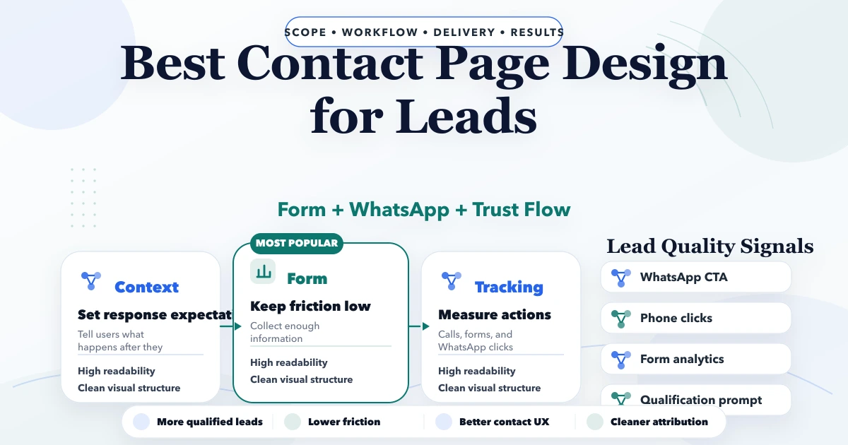
Best “Contact” Page Design for Leads
Best contact page design for leads with forms, trust blocks, WhatsApp, map choices, pricing, and CRO tips for Indian business websites.
Read articlePublished Updated
Plan a business website footer with useful navigation, contact details, legal links, location signals, accessibility, mobile UX, trust, and tracking.
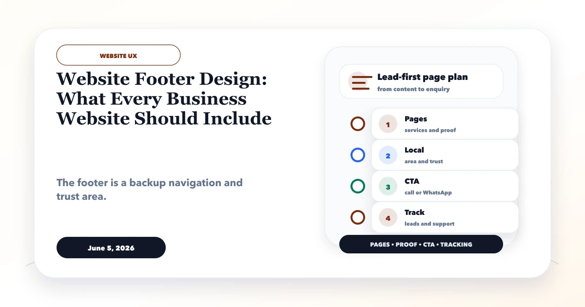
A business website footer is the final navigation and trust layer on every page. It should help a visitor recover when the main content did not answer the question, verify how to contact the business, find important service or policy pages, and understand who operates the website. It should not become a warehouse for every link the team could not place elsewhere.
The strongest footer is designed from real visitor tasks. A buyer may want to compare another service, check the service area, confirm an email address, read the privacy policy before submitting a form, or return to the main contact path. Each footer group should support one of those actions.
A practical business footer normally contains:
The exact list depends on the business model. A local clinic, SaaS platform, ecommerce store, and B2B software company should not share an identical footer.
Start with the questions visitors still ask after reading a page. Group them into four footer jobs:
| Footer job | Visitor question | Useful destination |
|---|---|---|
| Continue exploring | What else does this business offer? | Service or product links |
| Verify trust | Is this a real, reachable business? | About, contact, address, policies |
| Get help | Where do I go after purchase or signup? | Support, documentation, account access |
| Take action | How do I discuss my requirement? | Contact, demo, call, or WhatsApp |
If a link has no clear visitor job, it probably does not need footer-wide visibility.
Most service-business footers work with three to five labelled groups. For example:
Use labels people recognise. Solutions, Resources, and Company are understandable when their contents match. Internal department names or clever wording slow scanning.
A footer phone number should use a clickable tel: link on mobile. Email should use a valid address that someone monitors. WhatsApp should open the intended business conversation and must not replace a contact page that explains response expectations and alternate routes.
Before publishing contact details, assign an owner and test:
Do not add a fake office address for local SEO. If the business serves customers remotely or by appointment, state that honestly.
The footer should reinforce the site's hierarchy. Link to primary service hubs such as web application development, software development, and integrations and automation when those are active offers. Supporting articles should link into these hubs from their own context rather than all being inserted into the global footer.
Too many sitewide keyword links can make every page look identical and dilute attention. A footer is not a substitute for contextual internal linking inside service and blog content.
Useful identity details can include the legal or trading name, current brand name, copyright year, and relevant registration or tax details when the business intentionally publishes them. Do not show certificates, client logos, association marks, ratings, or guarantees without permission and evidence.
A concise description helps users arriving on deep pages understand the company. Keep it factual, such as what the business builds and whom it serves. Avoid a paragraph packed with locations and keywords.
At minimum, a lead-generating business website generally needs an accessible privacy notice explaining form and analytics data handling. Terms, cookie information, refund rules, acceptable-use terms, or subscription conditions depend on the actual service and jurisdiction.
Legal links should remain visible rather than hidden behind tiny text or colour with poor contrast. The linked pages must match current forms, analytics tools, communication channels, and business practices. A copied policy with another company's name is worse than a short policy that accurately describes the present setup.
A genuine local business can show its customer-facing address, hours, phone, map link, and service area. A multi-location business should avoid placing dozens of city keywords in every footer. Use one location directory or branch hub, then give each real branch a maintained page with its own contact and operating information.
Keep name, address, and phone details consistent with the contact page and maintained business profiles. If a location closes, update the global footer, structured data, contact page, map listings, and branch links together.
The footer CTA should match the site's main commercial action. Common examples include Discuss Your Project, Request a Demo, Get a Quote, or Contact Support. Do not present four equally prominent buttons for call, form, WhatsApp, newsletter, and download.
For VASUYASHII, a focused contact action can lead to the contact page, where requirements and response channels have more context. The footer can still display secondary contact methods as text links.
A newsletter field is useful only when the business actually sends relevant updates and can manage consent, unsubscribe, delivery, and data storage. Do not add an empty signup form for visual balance.
When lead capture belongs in the footer:
Long desktop columns often become an exhausting mobile stack. Prioritise the contact action, primary service links, and legal access. Collapsible groups can reduce length, but their controls must use real buttons, expose expanded state, and work without precise tapping.
Mobile acceptance checks include:
The footer uses the same accessibility standard as the rest of the website. Keep body text readable, colour contrast sufficient, focus indicators visible, and heading levels logical. Use a semantic <footer> landmark and real navigation labels so assistive technology can distinguish footer navigation from the main menu.
Social icons need accessible names. External links should communicate their destination; do not rely only on unfamiliar icons. Motion, hover effects, and decorative backgrounds must not make contact details difficult to read.
Footer links are crawlable internal links, but adding a page to the footer does not make weak content valuable. Use the footer for durable site architecture, not temporary indexing pressure. Confirm that linked URLs:
200 page;The footer should not link private account pages, search filters, tracking URLs, staging environments, or thin location variations intended only for keywords.
Track footer contact and navigation use separately from header clicks so the team can understand where visitors needed recovery. Useful events include destination, page path, link group, and action type. Do not send email addresses, phone numbers, message text, or form fields to analytics.
Review the footer whenever services, locations, support routes, policies, or business identity change. Add it to quarterly website QA because global mistakes repeat across every page.
Our implementation review starts with a footer inventory rather than a visual mock-up. We record every proposed link, owner, destination status, reason for global visibility, mobile priority, and measurement event. We then test the component on a short page, a long article, mobile navigation, keyboard-only use, and a page with the chat control open.
This is a process description, not a claim that a footer alone improves rankings or leads. It prevents a global component from shipping broken contact details, unsupported proof, duplicate links, or inaccessible controls.
There is no universal number. Include durable destinations users need across the site. A focused business footer may have 10-20 links; complex products may need more organised groups. Use visitor tasks, not a quota.
No. Link the major service categories globally and connect detailed services through contextual navigation, service hubs, and related content.
It can clarify site architecture and discovery, but sitewide links do not rescue thin or duplicate pages. Helpful content, correct hierarchy, performance, and contextual links still matter.
Show it when it is accurate, maintained, and appropriate for customers. Remote or appointment-only businesses should explain that model rather than publishing a misleading location.
Usually a clear contact CTA is easier to maintain. A compact form can work when validation, consent, spam protection, error handling, accessibility, and response ownership are properly implemented.
Review it after any service, location, policy, phone, email, brand, or analytics change and include it in scheduled quarterly QA.
List every current footer link and write one reason it needs to appear on all pages. Remove or relocate links without a durable visitor task, then test the final contact routes on mobile. Contact VASUYASHII for a focused business website review.
Related Articles
April 27, 2026
Best contact page design for leads with forms, trust blocks, WhatsApp, map choices, pricing, and CRO tips for Indian business websites.
Read article
June 6, 2026
Plan a Mohan Nagar business website for calls, visits, directions, service availability, trust, WhatsApp enquiries, and accurate local information.
Read article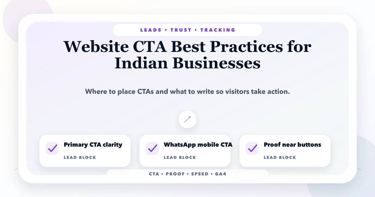
May 20, 2026
Design website CTAs for Indian businesses using buyer intent, action clarity, WhatsApp, calls, forms, placement, proof, mobile UX, tracking, and lead routing.
Read article
June 3, 2026
Website delivery checklist before final payment with pages, forms, SEO, speed, mobile, access handover, backups, and launch QA.
Read article