
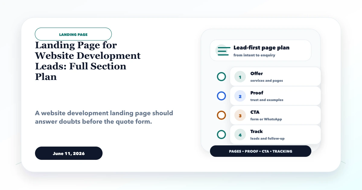
June 11, 2026
Website Development Landing Page Plan
Plan a website development landing page with a focused offer, proof, process, scope, qualification form, WhatsApp CTA, FAQs, tracking and follow-up workflow.
Read articlePublished Updated
Build a higher-converting service landing page with intent-matched sections, proof, offer clarity, CTA hierarchy, lead qualification, analytics, and mobile QA.
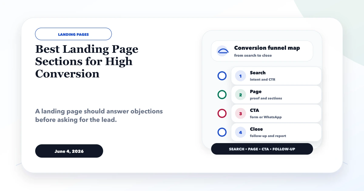
The strongest service landing page follows the visitor's decision sequence: confirm relevance, state the outcome, explain the offer, prove credibility, remove risk, answer objections, and make the next action easy. There is no universal “perfect” section count. A page for an urgent local service needs a different depth from a custom software consultation or a paid SaaS demo.
Conversion starts before layout. Match one page to one audience, one source of traffic, one offer, and one primary action. If a page tries to sell five services to three audiences with four CTAs, adding more sections will not fix the ambiguity.
Written by Tushar C., Founder of VASUYASHII, based on the current VASUYASHII page-planning and lead-tracking process. The framework is a testing baseline, not a guaranteed conversion formula. Results depend on traffic quality, market demand, offer strength, proof, speed, and follow-up.
Write one sentence: “For [specific visitor] arriving from [source], this page helps them [desired outcome] by offering [service or asset], and asks them to [primary action].”
Example: “For Indian distributors searching for custom inventory software, this page explains a phased stock-control implementation and asks the owner to request a workflow review.” This sentence controls the copy, proof, fields, and CTA.
Choose a primary conversion such as form submission, demo request, qualified WhatsApp chat, call, booking, or purchase. Secondary actions can support visitors who are not ready, but should not visually compete with the primary action.
| Section | Decision it supports | Essential content |
|---|---|---|
| 1. Hero | Am I in the right place? | Audience, outcome, offer, CTA, immediate proof cue |
| 2. Problem context | Do you understand my situation? | Specific symptoms and consequences |
| 3. Offer | What exactly will I get? | Deliverables, boundaries, format, timeline context |
| 4. Outcome or use cases | How will this help? | Practical before/after workflow without invented claims |
| 5. Proof | Why trust you? | Relevant case evidence, process artefacts, credentials, reviews |
| 6. Process | What happens after I respond? | Steps, responsibilities, expected decisions |
| 7. Fit and non-fit | Is this right for me? | Qualification and honest exclusions |
| 8. Pricing context | Can I afford or evaluate it? | Range, package, or cost drivers |
| 9. Objections and FAQs | What could stop me? | Specific answers close to the decision |
| 10. Final CTA | What should I do now? | Repeated offer, expectation, low-friction action |
Not every page needs all ten as separate bands. Combine adjacent decisions when the offer is simple. Preserve the logic even when the visual composition changes.
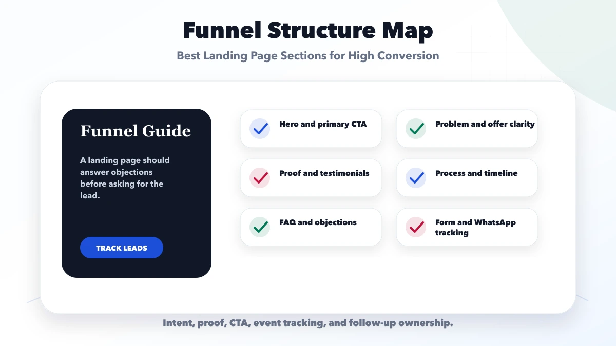
Use a literal headline that names the service or desired outcome. Put the differentiated value in the supporting copy. Within the first viewport, clarify who the offer is for, what the visitor can get, why the provider is credible, and what happens after the CTA.
Avoid vague headlines such as “Transform Your Future.” A better B2B example is “Custom Inventory Software for Multi-Location Distributors,” followed by the operational outcome and scope. Keep visual proof relevant to the service; a real interface, deliverable, team, or result explanation is more useful than an atmospheric stock image.
Use one primary CTA label that describes the action: “Request Workflow Review,” “Book a 20-Minute Call,” or “See Live Demo.” “Submit” does not explain value.
Describe observable situations, not exaggerated fear. For example: duplicate lead ownership, delayed quotations, stock reports that do not match physical movement, or website enquiries with no source tracking. The visitor should recognise their workflow.
Keep this section short if search intent is already strong. For colder social traffic, add more context and explain why the current workaround becomes risky as the business grows.
List deliverables and exclusions. If the offer is a landing-page project, state whether copywriting, design, development, analytics, form delivery, hosting, revisions, and post-launch support are included. If it is a consultation, state duration, participants, required preparation, and the output.
Specific scope reduces low-quality enquiries and protects trust. Do not call a discovery call a “free audit” if no audit is delivered.
Translate features into operational change. “Role-based dashboard” is a feature; “each sales manager sees only their team and overdue follow-ups” is a use case. Show two to four scenarios matched to the audience.
Do not invent percentages. If verified data is unavailable, use workflow evidence: screenshots, sample deliverables, annotated prototypes, process maps, or a transparent explanation of what the implementation changes.
Place proof where doubt occurs. A claim about interface quality can link to a live demo. A claim about technical scope can show architecture or acceptance criteria. A claim about service can use a genuine review with source and permission.
Strong proof can include:
Logos without context and anonymous praise are weak substitutes for evidence.
Show what happens after the CTA. A simple service process may be discovery, scope, prototype, build, UAT, launch, and support. Explain what the client must provide and where approvals occur.
If a lead will receive a call, say who calls and the typical timeframe. If the first step is WhatsApp, prefill enough context to make the conversation useful. Read the lead funnel guide for post-click ownership.
Qualification improves conversion quality even if raw submission count decreases. State the business stage, budget model, urgency, technical dependency, or decision-maker involvement required. Also state who should not use the offer.
For example, a custom software discovery service may fit businesses with a defined operational problem and process owner, but not someone looking for an instant clone of a large platform at a template-site budget.
Use a fixed price only for a genuinely standardised offer. Otherwise provide a starting range, package comparison, or cost-driver table. Name what changes effort: number of pages, content readiness, integrations, design originality, testing, languages, tracking, and support.
Price transparency helps self-qualification. Hiding every signal can increase calls while reducing useful opportunities.
Answer specific concerns: ownership, timeline, revisions, cancellation, data access, support, migration, compatibility, and who writes content. Keep contractual or security answers accurate. Avoid broad guarantees such as “rank number one” or “100% conversion increase.”
Risk reversal can be a small paid discovery, phased milestone, prototype, live demo, clear acceptance criteria, or cancellation boundary. It does not need to be an unlimited money-back promise.
Restate the audience and outcome, then repeat the primary action. Add practical expectation: what information is needed, how long the first response usually takes, and whether the call is sales, discovery, or support.
Use a short form at this stage. Ask only what the team will use immediately: name, contact method, company, requirement category, and concise context. Additional qualification can happen after trust is established.
On mobile, keep tap targets clear and prevent fixed WhatsApp or chat widgets from covering fields, cookie controls, or the main CTA. Avoid repeated sticky bars that consume the viewport. The action should remain available, but the content must still be readable.
Test with the keyboard open, validation errors visible, slow network, and an older device. Check that form success is announced, entered data is preserved after a recoverable error, and the user does not submit twice because the loading state is unclear.
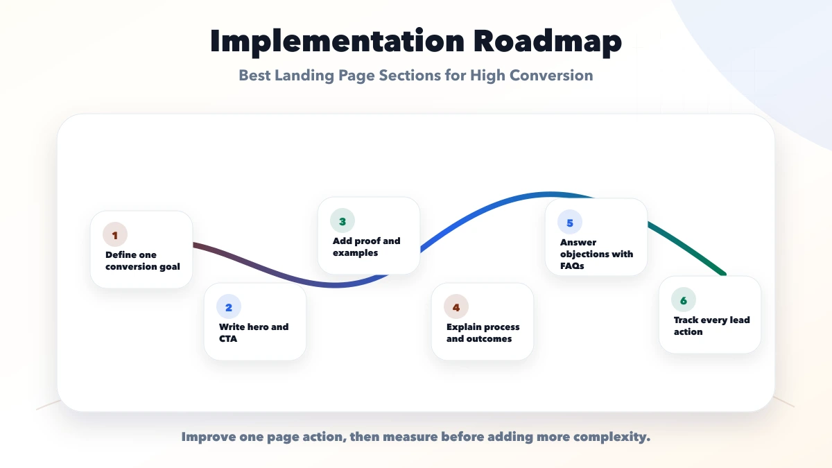
Track the funnel in stages:
Capture campaign and landing-page context without sending personal data to analytics. Test events after deployment. Use both analytics and the lead system because an outbound click does not prove that a useful conversation occurred.
Evaluate conversion rate with lead quality, not alone. A page that generates fewer but better-scoped enquiries can be commercially stronger.
Do not continuously change five sections and call the outcome a test. Start with research: search terms, call notes, form quality, recordings where privacy-compliant, and sales objections. Prioritise the largest uncertainty, such as headline relevance, offer format, proof, or form friction.
Change one meaningful variable, record the hypothesis, test long enough to avoid day-to-day noise, and review downstream lead quality. Small sites may learn more from interviews and qualified-lead analysis than from an underpowered statistical test.
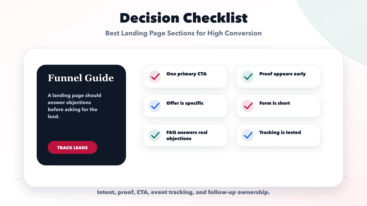
For a web-development offer, the sections also need scope boundaries, account ownership, qualification fields, lead routing, and traffic-source alignment. Use the website development landing page plan as the campaign-specific implementation layer.
Use enough sections to complete the visitor's decision. A simple urgent offer may need five; a high-consideration B2B service may need ten or more. Relevance and evidence matter more than count.
For focused paid campaigns, reduced navigation can lower distraction. For SEO landing pages, useful site context and internal links may support trust and discovery. Test the page's intent rather than applying a universal rule.
Use an early form when intent is high and the request is simple. For complex services, an early CTA can scroll to a form after proof and scope. Do not force a long form before explaining the offer.
It can reduce friction for suitable audiences, but it needs context, response ownership, privacy-safe tracking, and follow-up. A click alone is not a lead.
No. Unnecessary content is bad. High-consideration offers often need depth; clear hierarchy lets visitors scan and find the decision information they need.
VASUYASHII can scope copy structure, UI, development, form delivery, and analytics within landing-page design services. Exact work and measurement ownership should be stated in the proposal.
Write the conversion-contract sentence, collect the top five buyer objections, and choose one primary action before opening a design tool. For a focused landing-page plan, contact VASUYASHII with the audience, traffic source, offer, proof available, and lead-handling process.
Before comparing low-price offers, use the affordable landing-page buyer guide to separate essential delivery scope from avoidable extras.
Compare realistic workstreams, ownership, hidden exclusions, and planning bands in the landing page cost in India guide.
Related Articles
June 11, 2026
Plan a website development landing page with a focused offer, proof, process, scope, qualification form, WhatsApp CTA, FAQs, tracking and follow-up workflow.
Read article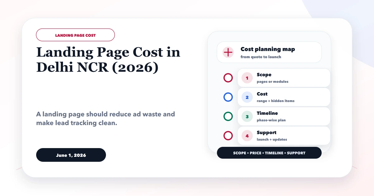
June 1, 2026
Estimate a Delhi NCR landing page through offer, copy, proof, form, WhatsApp, analytics, integrations, experiments and practical budget bands.
Read article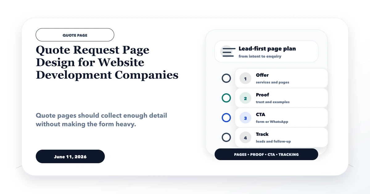
June 11, 2026
Design a website quote request page with scope-aware fields, budget and timeline context, privacy-safe attachments, confirmation, and lead follow-up.
Read article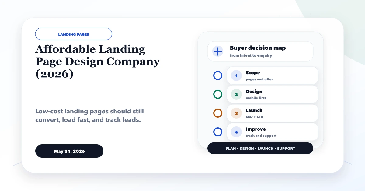
May 31, 2026
Compare affordable landing-page providers by offer clarity, copy, responsive design, forms, speed, analytics, ownership, testing, and complete delivery scope.
Read article