
March 24, 2026
Landing Page Cost in India: Scope and Pricing
Compare landing page cost in India by scope, copy, design, development, forms, WhatsApp, analytics, integrations, QA, ownership, and hidden exclusions.
Read articlePublished Updated
Design a lead-generation landing page with clear messaging, trust signals, focused CTAs, WhatsApp or forms, mobile speed, tracking, and testing.
A lead-generation landing page should move one defined audience from one offer to one measurable next step. It should not count every button tap as a successful lead. The page, form, WhatsApp message, response owner, and analytics event must preserve enough context to decide whether the enquiry is qualified.
Whether you run Meta ads, Google ads, or drive traffic from Instagram/YouTube, a focused landing page gives the business a measurable route for:
This guide shows a practical landing-page design system for Indian service businesses, including first-screen clarity, offer structure, proof, CTA placement, lead confirmation, mobile QA, and a measurement workflow. It does not promise a conversion rate without traffic and lead-quality evidence.
A lead generation landing page is a page that:
Unlike a normal website (which has many pages), a landing page is a focused conversion machine.
Use landing pages when:
Landing pages work best for:
If you want high-converting web applications and funnels, see: Web Applications Services
Before designing anything, decide the single goal:
You can support with a secondary option, but never make 3 primary CTAs competing.
Best practice: Primary CTA = WhatsApp / Form Secondary CTA = Call or Contact page
Write a lead contract before the wireframe:
| Item | Example for a website-development offer |
|---|---|
| Audience | Established service business replacing an outdated website |
| Offer | Requirements review and scoped website plan |
| Primary action | Submit a short requirement form |
| Required context | Business type, current website, target outcome, timeline |
| Confirmation | Server confirms the enquiry was stored or delivered |
| Analytics | Fire generate_lead only after confirmed success |
| Sales owner | Named person checks and responds within the stated window |
| Quality result | Relevant, contactable enquiry with a realistic requirement |
A click on “Contact”, a form validation error, or an opened WhatsApp window is not the same as a confirmed lead. Google documents generate_lead as a recommended event for a generated lead in its GA4 event reference. Keep CTA clicks as separate diagnostic events and reserve lead success for the confirmed outcome.
Suppose a Delhi NCR consultancy promotes a fixed-scope operations audit. The landing page should name the business type and deliverable in the hero, show who performs the audit, explain what inputs are needed, provide a realistic timeline, answer data-confidentiality questions, and ask for company type, current process, phone/email, and preferred schedule.
The thank-you state should confirm that the requirement reached the business and explain the next response step. The WhatsApp fallback should prefill “operations audit” and the page source instead of a generic “Hi”. This gives the sales owner enough context to distinguish a relevant enquiry from an accidental click.
Review the path as one system: ad or search query, landing-page promise, proof, form, success response, analytics event, notification, and first follow-up. Improving only the button color cannot repair a broken handoff.
Below is a proven structure that converts well across industries.
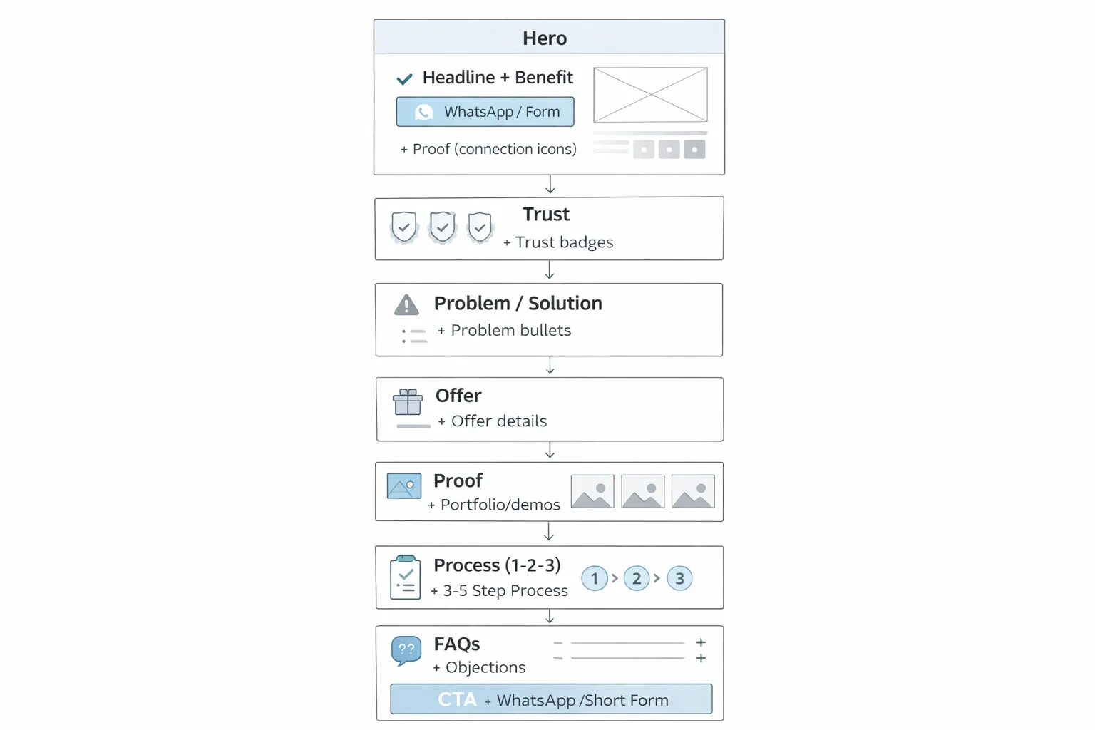
Must include:
Example headline: “Get a High-Performance Website That Generates Leads”
Add:
Explain:
Keep it short. Use bullet points.
List:
Show:
You can show demos like:
And portfolio:
People trust a clear process: 1) Requirements 2) Design 3) Development 4) Review 5) Launch
You don’t need full pricing, but “starting from” helps filter low-quality leads.
Example: “Packages start from ₹XX,XXX depending on pages and features.”
Add 6–10 FAQs:
Repeat CTA:
Landing page copy should be:
Use this formula: Clarity + Proof + CTA
For Indian service businesses: ✅ WhatsApp often converts fastest.
Example WhatsApp CTA: 👉 WhatsApp: Chat on WhatsApp
Keep form short:
Avoid long forms with 10 fields.
Best funnel: WhatsApp primary + short form secondary.
Most landing traffic is mobile. Follow these:
If mobile UX is weak, ad spend gets wasted.
Slow pages = fewer leads. Improve speed by:
Speed improves:
For ad landing pages:
But basic SEO should still be done:
If you plan long-term ranking, convert the landing page into a full service page later.
If you run ads, track:
This helps you improve conversion and reduce cost per lead.
The current VASUYASHII website distinguishes direct WhatsApp clicks, contact-page clicks, demo opens, phone clicks, and valid lead-form submissions with separate privacy-safe analytics events. A valid form submission records generate_lead; it does not send the visitor's name, phone, email, or requirement text into analytics.
That distinction matters on a landing page. A button click is an intent signal, not automatically a qualified lead. Build the measurement chain in stages:
| Funnel stage | Example event or record | Business question |
|---|---|---|
| Offer viewed | Page view with source/campaign | Did the intended audience reach this page? |
| Primary CTA clicked | Placement-specific WhatsApp, form, demo, or call event | Which section created action? |
| Valid requirement submitted | generate_lead or CRM lead | Did the visitor provide usable details? |
| Qualified | Sales status with reason | Was the requirement relevant and affordable? |
| Proposal or booking | CRM or operations record | Did the lead progress? |
| Won or lost | Final outcome and reason | Which source created business value? |
Keep analytics identifiers and sales records connected through privacy-appropriate campaign and source fields, not private message content. Review the WhatsApp CTA placement guide for section labels and GA4 lead tracking guide for event planning.
Do not redesign the full page after a few visits. Maintain a backlog where each test has a problem statement, evidence, one major change, success metric, minimum review period, and lead-quality check.
High-value tests may include:
Compare qualified leads, not only click-through rate. A broader promise may produce more chats but fewer suitable projects. Record sales feedback before declaring a winning version.
Use real screenshots, named project pages, attributable reviews, transparent process, or a working demo. Do not invent project counts, client logos, revenue gains, or conversion percentages. If customer evidence is unavailable, a clear deliverable list and inspectable services collection are stronger than unsupported badges.
1) Too many CTAs competing 2) No proof (portfolio/demos missing) 3) No clear offer (visitors don’t understand) 4) Long paragraphs and clutter 5) Slow loading page 6) Form too long 7) No FAQs (objections not answered) 8) No mobile-first design
Before publishing, confirm:
If you want a premium landing page that generates WhatsApp leads and improves your ad results, we can build it professionally.
👉 WhatsApp: Chat on WhatsApp
👉 Contact: Contact page
A landing page should have one job. For a software service, that may be demo requests. For a clinic, appointment enquiries. For a local service business, WhatsApp and call leads.
Before designing the page, define:
When the offer needs a downloadable checklist, calculator, or requirements worksheet, use the lead magnet guide for software companies to connect the asset with qualification and follow-up instead of adding a generic PDF.
When the offer is website development, connect the hero, proof, scope, form, WhatsApp message, analytics event, and response owner. The website development landing page blueprint provides the full section and follow-up sequence.
Useful links: integrations, services, and contact.
WhatsApp usually converts best, supported by a short form as secondary option.
Optional. “Starting from” pricing can help filter low-quality leads.
Long enough to answer objections, usually 8–10 sections. Avoid unnecessary content.
For ads, SEO is not primary, but basic SEO structure helps quality and trust.
No clarity + no proof + no strong CTA above the fold.
If budget is the constraint, review what an affordable landing-page provider should include before removing measurement, QA, or lead-delivery work.
If traffic arrives but leaves without a useful action, follow the bounce-rate practical fixes to audit intent, first-viewport clarity, mobile speed, CTA relevance, and valid lead tracking.
Related Articles
March 24, 2026
Compare landing page cost in India by scope, copy, design, development, forms, WhatsApp, analytics, integrations, QA, ownership, and hidden exclusions.
Read article
March 17, 2026
Use this mobile-friendly website design guide to improve responsive layouts, navigation, forms, speed, accessibility, SEO, and lead conversion in 2026.
Read article
March 17, 2026
Use practical website UI/UX best practices for clearer mobile journeys, stronger trust, accessible forms, faster decisions, and qualified business leads.
Read article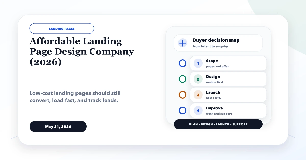
May 31, 2026
Compare affordable landing-page providers by offer clarity, copy, responsive design, forms, speed, analytics, ownership, testing, and complete delivery scope.
Read article