
March 20, 2026
Website Development Trends in 2026: Buyer Guide
Evaluate 2026 website trends by business value: performance, accessibility, AI workflows, content operations, analytics, privacy, security, and maintenance.
Read articlePublished Updated
Responsive website development explained with mobile-first design, breakpoints, images, Core Web Vitals, SEO impact, mistakes, and best practices.

In 2026, a website is considered “professional” only if it works perfectly on mobile. Most visitors will open your website on a phone first—especially in India. If your website looks broken, text is hard to read, buttons are difficult to tap, or the layout feels messy, users leave within seconds. That single moment can cost you a lead, a customer, or even your brand trust.
That’s exactly why responsive website development matters. Responsive means your website automatically adapts to different screen sizes and devices:
Responsive is not “extra design.” It’s the standard. A responsive website improves:
This guide explains responsive website development in a simple, business-friendly way, including mobile-first strategy, breakpoints, layout rules, speed impact, and a practical checklist used by professional teams.
A responsive website automatically adjusts these elements:
In short: one website, perfect experience on every screen.
Many business sites receive substantial mobile traffic, but the share varies by source, audience, and campaign. Check GA4 or another first-party analytics source before choosing breakpoints and QA priorities.
Google documents mobile-first indexing, so content, metadata, structured data, links, and important images should remain available in the mobile experience. Responsive layout alone does not guarantee rankings.
On mobile, your WhatsApp CTA, contact button, and form must be easy to use. If users struggle, they abandon.
If you want a fast, SEO-ready site or web app with premium responsive UX, see: Web Applications Services
One website that adapts fluidly across devices. Best for most businesses.
Multiple fixed layouts for specific screen widths. More maintenance, less flexible.
Separate app (Android/iOS). Not a replacement for a website. Most businesses should first build a responsive website.
Modern teams build mobile-first. This means: 1) design for phone first 2) then expand for larger screens
Why mobile-first works:
A desktop-first approach often creates problems like:
Mobile-first avoids these problems from day one.
Breakpoints are screen-width points where layout changes. For example:
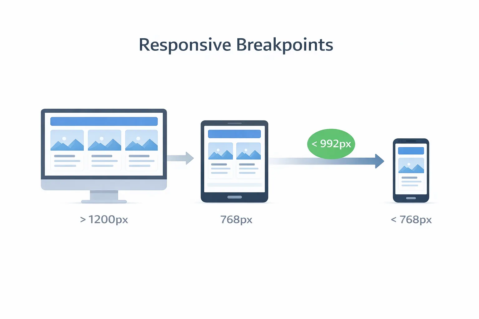
Important note: You don’t need 20 breakpoints. You need clean layout rules that naturally adapt.
Modern responsive sites use:
Avoid old fixed layouts.
Bad:
width: 1200px;Good:
max-width: 1200px; width: 100%;Fixed widths cause overflow on small screens.
Use consistent spacing scale:
Use rem units so fonts scale cleanly.
Responsive images must be:
Forms fail most on mobile. Improve by:
Responsive design helps SEO because:
A site can have great content but still struggle if mobile UX is poor.
Responsiveness is not only about layout. It also affects speed.
Mobile users often have:
Speed best practices:
A fast responsive site feels premium and converts better.
For many Indian service businesses, WhatsApp is an important enquiry path. Its actual conversion rate should be measured rather than assumed, and responsive UI must keep the destination easy to reach.
Example WhatsApp CTA: 👉 WhatsApp: Chat on WhatsApp
Also keep a backup: 👉 Contact: Contact page
Corporate buyers browse on mobile while traveling. A broken mobile layout reduces trust instantly.
Customers are already on phone at the table. Mobile UX is the product.
Most ad traffic is mobile. If your landing page is not responsive, ad spend gets wasted.
Even if staff uses desktop, owners often check dashboards on phone. Responsive dashboards are a big advantage.
If you build dashboards/portals, explore: Web Applications Services
Cause:
Fix:
max-width: 100%Cause:
Fix:
Cause:
Fix:
Cause:
Fix:
Cause:
Fix:
Before you publish a site (or a blog page), test:
1) Open on real Android + iPhone 2) Check header + menu 3) Scroll and tap CTA buttons 4) Check images (no overflow) 5) Fill contact form (keyboard doesn’t break layout) 6) Test slow network (throttling) 7) Run Lighthouse performance check
A website is responsive only when it works smoothly on real devices.
A responsive site should feel clean, simple, and smooth.
Responsive website development means:
In 2026, responsiveness is not a bonus feature. It’s the standard for every serious business.
If you want a modern, responsive website that loads fast, looks premium, and converts visitors into WhatsApp leads, we can build it for you.
👉 WhatsApp: Chat on WhatsApp 👉 Services: Web Applications Services 👉 Services: View our services 👉 Contact: Contact page
Responsive development should be tested around real content and real business actions, not only screen resizing. The important question is whether a mobile visitor can understand, trust, and contact the business quickly.
Check:
For lead-focused pages, responsive QA should connect to web application services, services, and contact.
VASUYASHII's current website is tested as a static Next.js build across mobile and desktop layouts. The useful evidence is not a single narrow screenshot; it is a repeatable acceptance pass covering navigation, longest text, contact paths, images, forms and layout stability at multiple widths.
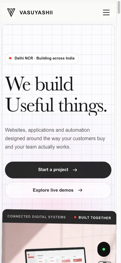
This captured mobile viewport confirms the visible navigation, headline, calls to action and first content preview. It does not replace testing at intermediate widths or on real devices.
| Responsive checkpoint | Mobile test | Decision rule |
|---|---|---|
| navigation | menu opens, focus moves and links remain reachable | block launch if primary routes are trapped |
| content | longest title and table fit without clipping | wrap or restructure; do not shrink blindly |
| images | correct intrinsic size and no layout jump | reserve dimensions and optimise source |
| form | label, keyboard, error and submit state work | validate with touch and keyboard |
| CTA | phone, WhatsApp and contact destination are accurate | preserve service context |
Decision example: a five-page service website can use one responsive component system. A staff dashboard with wide data tables needs an explicit mobile strategy such as priority columns, scroll containers or task-specific cards; “make it responsive” is not a sufficient requirement.
Limitations: Lighthouse mobile emulation is diagnostic, not proof of every real device. VASUYASHII does not claim that responsive layout alone guarantees SEO or conversions. Field performance, content clarity, accessibility and backend reliability remain separate quality areas.
Use the official WCAG overview for perceivable, operable, understandable and robust requirements. Google's mobile-first indexing guidance explains mobile-content parity, while Web Vitals guidance defines LCP, INP and CLS. Validate field data when available rather than treating one lab score as a permanent result.
Mobile-friendly means it works on mobile. Responsive means it adapts cleanly to all devices and screen sizes.
Responsive design is Google's recommended design pattern, but ranking still depends on crawlability, content, links, performance, and many other signals. Keep the same primary content and metadata available on mobile.
Business sites typically ₹20,000–₹1,20,000 depending on pages and design quality. Portals cost more.
Mobile-first design + responsive grid + optimized images + speed focus.
Yes, with a good theme and minimal heavy page builders. Custom sites provide stronger control.
Related Articles
March 20, 2026
Evaluate 2026 website trends by business value: performance, accessibility, AI workflows, content operations, analytics, privacy, security, and maintenance.
Read article
March 21, 2026
Website development process explained for 2026 with discovery, sitemap, wireframes, UI design, SEO setup, speed, QA, launch, and maintenance.
Read article
March 17, 2026
Use this mobile-friendly website design guide to improve responsive layouts, navigation, forms, speed, accessibility, SEO, and lead conversion in 2026.
Read article
March 15, 2026
Plan a startup website with the right pages, positioning, lead flow, technology, SEO, timeline, and cost decisions for an efficient 2026 launch.
Read article