May 2, 2026
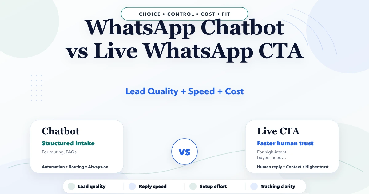
WhatsApp Chatbot vs Live WhatsApp CTA
WhatsApp chatbot vs live WhatsApp CTA: lead quality, response speed, setup cost, tracking, and best use cases for Indian businesses in 2026.
Read articleMarch 31, 2026
How to build trust on a website using proof, reviews, demos, FAQs, and clarity so visitors feel confident enough to enquire or buy.
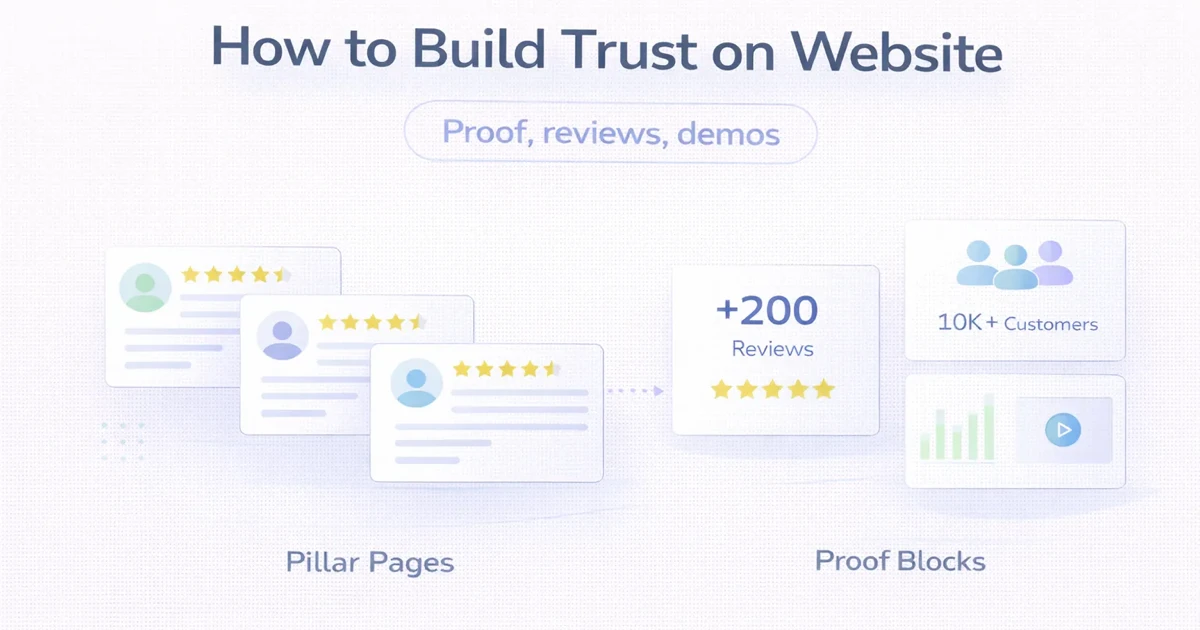
Most websites do not lose conversions because the visitor dislikes the design. They lose conversions because the visitor is not convinced yet. Trust is the missing layer. People ask themselves basic questions: is this business real, is it experienced, will they deliver, is there proof, and what happens after I contact them?
That is why trust-building is not one testimonial block at the bottom of the page. It is the overall experience of clarity, proof, credibility, and reduced risk.
This guide explains how to build trust on a website using the elements that actually help visitors move from doubt to action.
Strong website trust usually comes from a combination of:
Visitors do not trust a page because it says "trusted." They trust what the page shows.
Trust starts with clarity:
If the headline, offer, and CTA are vague, trust drops before reviews even matter.
Related reading:
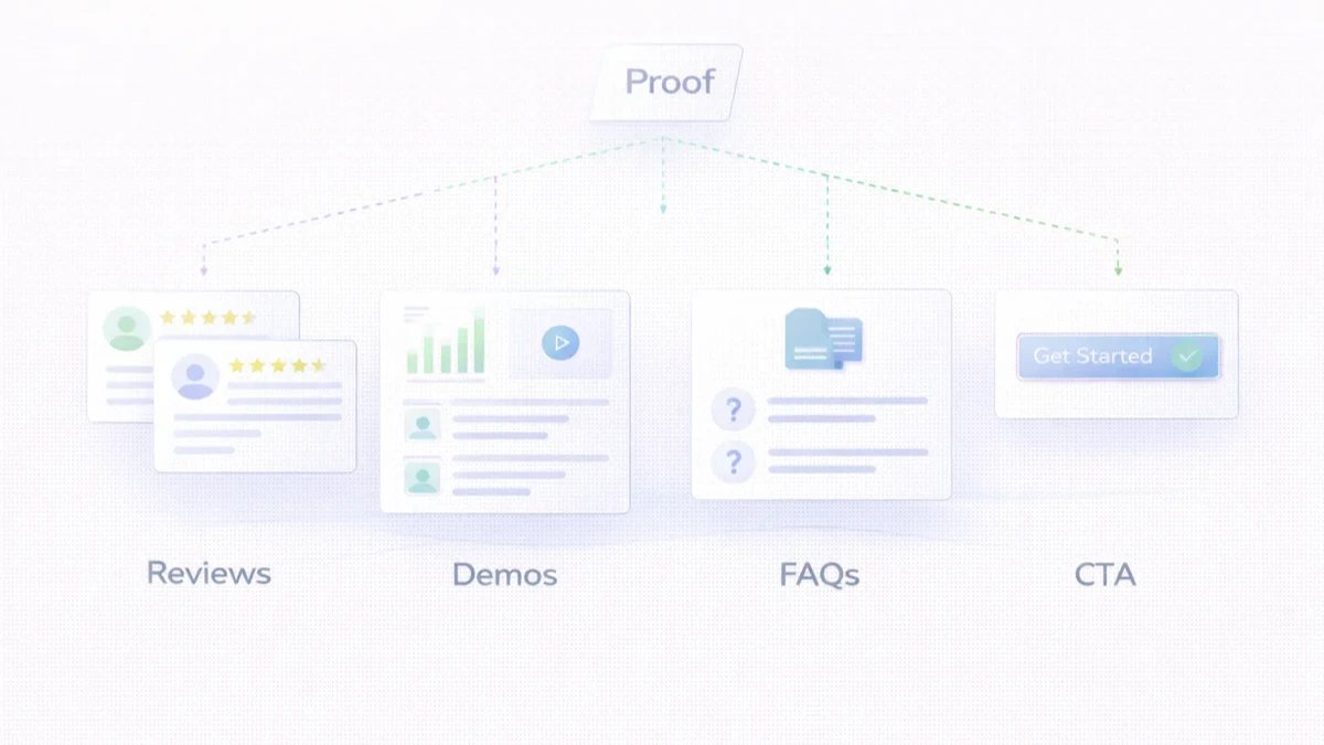
This is strongest:
Show people how the work moves forward. A visible process reduces fear.
Use reviews that feel specific, not generic praise. The best reviews mention:
Demos are powerful because they reduce imagination gap. People can see the quality instead of guessing it.
Relevant examples are often more convincing than a long paragraph about capability.
If your website gets traffic but not enough enquiries, the problem may be trust, not only traffic. Start by checking what proof the visitor actually sees before the first CTA.
Clarify the offer and add strong proof near key CTAs.
No. Testimonials help, but process clarity and visible examples matter too.
Yes. Demos reduce uncertainty and make the offer feel more real.
Sometimes full pricing, sometimes ranges. But total opacity can reduce trust for some buyers.
Indirectly yes, because stronger pages often improve engagement and content quality.
Use process clarity, specific examples, founder credibility, and clean communication.
Not only at the bottom. Put proof close to key decision points.
Making the page sound polished without actually proving anything.
If you want better enquiries from the traffic you already have, the next step is to strengthen proof, reviews, demos, and CTA clarity instead of only changing colours or layout blocks.
Related Articles
May 2, 2026
WhatsApp chatbot vs live WhatsApp CTA: lead quality, response speed, setup cost, tracking, and best use cases for Indian businesses in 2026.
Read article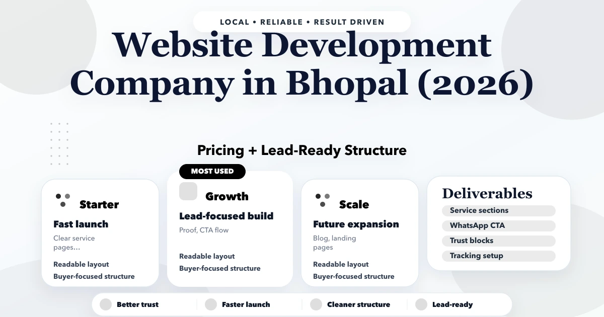
May 1, 2026
Bhopal website development company guide with pricing, scope, timeline, SEO structure, and lead-focused planning for businesses in 2026.
Read article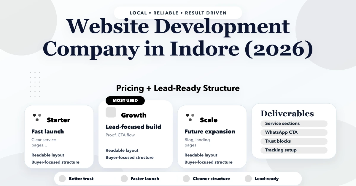
May 1, 2026
Indore website development company guide with pricing, scope, timeline, SEO structure, and lead-focused planning for businesses in 2026.
Read article