
April 16, 2026
Technical SEO Checklist for Next.js Websites
Audit Next.js technical SEO for rendering, metadata, canonicals, sitemap, robots, redirects, structured data, internal links, images, and Core Web Vitals.
Read articlePublished Updated
Fix CLS in Next.js by reserving space for images, fonts, embeds, banners, async content, and animations, then validate changes with lab and field data.
Cumulative Layout Shift (CLS) measures unexpected visual movement. A user may try to tap a button, only for an image, banner, font, form error, or late component to move the target. In a Next.js site, the cause is usually not the framework itself; it is missing size information, unstable content insertion, font metric differences, or animation of layout-changing properties.
The correct fix is to identify the element that moved and the element that caused it, reserve the final geometry, and verify the same user journey after deployment.
Give images and media an intrinsic size or stable aspect-ratio container, use next/image correctly, load fonts through next/font with compatible fallbacks, reserve space for embeds and async blocks, keep banners from being inserted above existing content, render form errors in planned regions, and animate transform/opacity rather than dimensions or position where possible. Validate with Chrome DevTools/Lighthouse and field data because lab and real-user CLS can differ.
For a broader performance review, use website speed optimisation or web application development.
According to web.dev's CLS guidance, CLS is based on unexpected layout-shift scores during the page lifecycle. User-initiated movement within the allowed interaction window may be treated differently, so reproduce the actual journey rather than assuming every visual change is counted.
Use three sources:
| Evidence | What it helps find | Limitation |
|---|---|---|
| PageSpeed/CrUX field data | Real-user origin or URL experience | Aggregated and delayed; may not identify element |
| Lighthouse | Repeatable initial-load lab test | Does not cover every interaction or device |
| DevTools Performance/Layout Shifts | Specific moving elements and timing | Requires a reproducible session |
Record viewport, network/device profile, consent state, login state, route, and actions. A cookie banner, carousel, validation error, or client-only widget may appear only in a particular path.
The official Next.js Image documentation explains that width and height provide the intrinsic aspect ratio used to reserve space; remote images require dimensions because Next.js cannot inspect them at build time.
import Image from "next/image";

<Image
  src="/team/tushar.webp"
  alt="VASUYASHII founder reviewing a software workflow"
  width={800}
  height={600}
  sizes="(max-width: 768px) 100vw, 50vw"
  style={{ width: "100%", height: "auto" }}
/>
width and height do not force that rendered size when CSS makes the image responsive; they establish the ratio. The sizes prop also helps the browser select an appropriate responsive source.
For fill, the parent must have a stable size and appropriate positioning:
<div className="relative aspect-[4/3] overflow-hidden">
  <Image
    fill
    src={photoUrl}
    alt={photoAlt}
    sizes="(max-width: 768px) 100vw, 33vw"
    className="object-cover"
  />
</div>
Do not calculate the container height only after the image loads.
If a CMS provides an image URL but not its dimensions, extend the content model to store width, height, or aspect ratio. For legacy content, generate metadata during ingestion or use a known ratio container with a deliberate crop.
Avoid a temporary zero-height wrapper. A blur placeholder improves perceived loading but does not replace dimensions.
Font swapping can change line breaks and element height when fallback and final fonts have different metrics. The Next.js Font documentation describes self-hosted optimisation and fallback adjustment through next/font.
import { Inter } from "next/font/google";

const inter = Inter({
  subsets: ["latin"],
  display: "swap",
});

export default function RootLayout({ children }) {
  return (
    <html lang="en" className={inter.className}>
      <body>{children}</body>
    </html>
  );
}
Load only required families, weights, subsets, and axes. Apply the font class at a stable scope, and test long headings at mobile widths. If using a local font, provide accurate files and fallback behaviour.
Do not hide all text until a font arrives; that trades stability for delayed content.
Videos, maps, booking widgets, chat tools, forms, advertisements, and social embeds often resize after JavaScript loads. Wrap them in a container matching the final dimensions.
.video-frame {
  aspect-ratio: 16 / 9;
  width: 100%;
  background: #f1f5f9;
  overflow: hidden;
}

.video-frame iframe {
  width: 100%;
  height: 100%;
  border: 0;
}
If the final height varies, reserve a conservative minimum and allow content to grow below rather than pushing already visible content unexpectedly.
Cookie notices, app-install prompts, discount bars, login warnings, and location prompts can move the header and hero after hydration. Choose one of these patterns:
Respect accessibility: overlays must not cover required controls, trap focus incorrectly, or make content unreadable.
Client-side user state can replace a short skeleton with a tall account panel. Search suggestions, prices, reviews, related posts, and dashboards can do the same.
The placeholder and loaded component should share stable dimensions for the tested breakpoint. If content can vary materially, use a minimum-height region or place additional results below existing content.
Avoid rendering nothing on the server and inserting the entire above-the-fold component after mount unless there is a genuine client-only requirement.
Inline error messages often push fields and the submit button after a user submits. Reserve an error region, keep labels stable, and associate messages with inputs.
.field-message {
  min-height: 1.25rem;
}
For a general form-level error, place a planned alert block near the form heading and move focus deliberately. Do not inject it above the page header.
Animating height, width, top, left, margins, or background position can trigger layout or paint work and may create unstable movement. Prefer transform and opacity for decorative motion.
For an accordion, user-initiated expansion is expected, but surrounding content still needs coherent behaviour. Do not run automatic expanding/collapsing sections above the user's current reading position.
Respect prefers-reduced-motion and avoid continuous motion that competes with content.
Slides with different text lengths can resize the carousel and shift following sections. Use a stable slide height at each breakpoint, constrain excerpts, or allow the carousel to grow to the tallest measured content before interaction.
Do not read layout measurements and write styles repeatedly during animation. Batch reads/writes or use CSS layout where possible.
Rendering one layout on the server and replacing it with another after checking window.innerWidth can cause a shift. Prefer responsive CSS. When JavaScript branching is necessary, make the server fallback geometrically compatible and avoid changing the main heading or navigation height after hydration.
Also investigate invalid HTML and hydration warnings; recovery can replace unexpected DOM.
Our implementation review captures before/after videos or screenshots, the responsible DOM region, the CSS/component change, and repeated mobile/desktop measurements. This first-party evidence prevents a single favourable Lighthouse run from being treated as a complete result.
| Cause | Weak patch | Durable fix |
|---|---|---|
| Unsized image | Hide until loaded | Intrinsic dimensions/aspect ratio |
| Remote CMS image | Guess height after request | Store dimensions in content model |
| Font swap | Delay all text | next/font, limited variants, compatible fallback |
| Async widget | Add random min-height | Contract based on actual component states |
| Banner | Insert at top after mount | Server render, reserve slot, or overlay |
| Form error | Push every field | Reserved accessible message region |
| Carousel | Measure on every slide | Stable breakpoint height/content constraint |
| Animation | Animate height/top | Transform/opacity where appropriate |
| Responsive JS | Replace desktop DOM after mount | CSS-driven responsive layout |
min-height across the whole page.priority or eager loading on every image; loading priority addresses different performance concerns.next/image fixes a parent with no stable dimensions.If the shift comes from a shared layout or client-side component used across routes, include it in a focused software development remediation scope instead of applying unrelated patches page by page.
sizes reflects real layout widths.Use the current Core Web Vitals guidance in PageSpeed/web.dev and evaluate the 75th percentile field experience when available. More importantly, identify and remove unexpected movement in critical journeys.
next/image automatically prevent CLS?It helps when used with intrinsic dimensions or a correctly sized fill parent. An unstable parent, late conditional rendering, or surrounding content can still shift.
font-display: swap?Yes. A fallback with different metrics can change line wrapping when the final font appears. next/font, fallback adjustment, limited variants, and layout testing reduce the risk.
The lab run covers one controlled page load. Field users may see different devices, consent states, interactions, dynamic content, or long sessions. Use both data types.
No. It should have a predictable layout contract. Fixed height may clip content; aspect ratio, minimum height, skeleton matching, or insertion below existing content may be more appropriate.
Contact VASUYASHII with affected URLs, PageSpeed/Search Console evidence, device/state where movement occurs, and any recent component or font changes.
Fix CLS at the component that lacks a stable geometry contract. Reserve the space, render predictable states, validate the exact user journey, and then wait for field data to confirm the production effect.
Related Articles
April 16, 2026
Audit Next.js technical SEO for rendering, metadata, canonicals, sitemap, robots, redirects, structured data, internal links, images, and Core Web Vitals.
Read article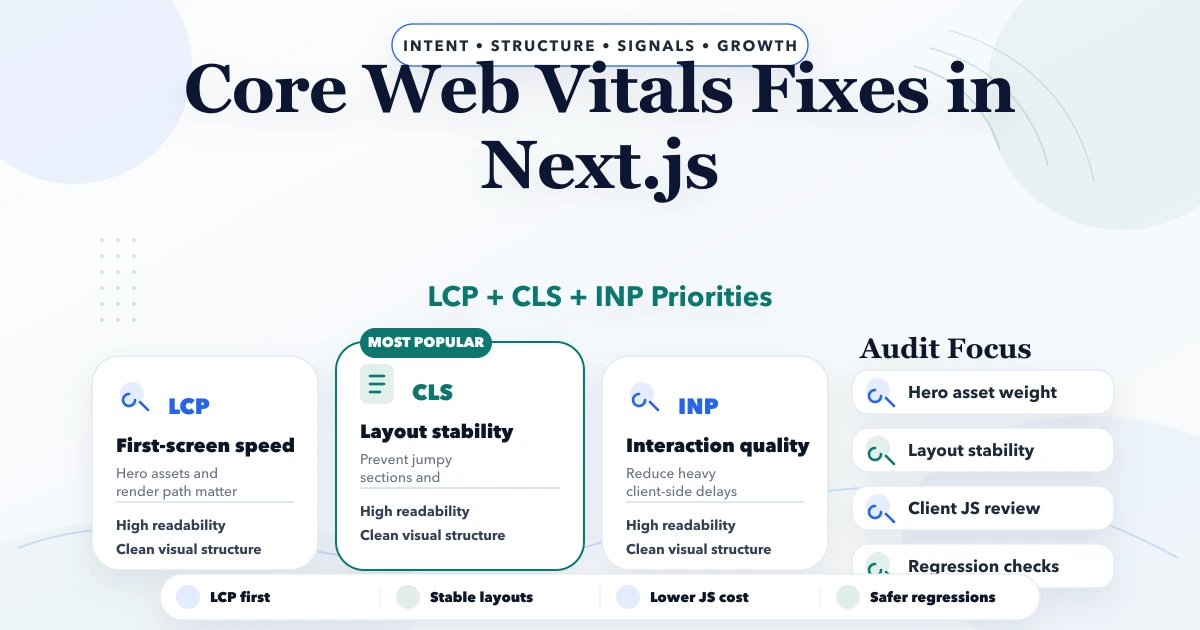
April 29, 2026
Core Web Vitals fixes in Next.js with LCP, CLS, INP, image, script, and layout guidance plus pricing and rollout advice for 2026.
Read article
May 13, 2026
fix slow images WebP pipeline: practical 2026 audit guide with checklist, pricing, roadmap, mistakes, FAQs, tools, and next steps for Indian SMBs today.
Read article
May 13, 2026
Find and fix JavaScript bloat with route measurement, bundle analysis, smaller client boundaries, deferred third parties, budgets, and regression checks.
Read article